

Why should you care about colour theory as an entrepreneur? Why can’t you slap some red on your packaging and be done with it? It worked for Coke, right? Well, not so fast…
Colour theory will help you build your brand. And that will help you get more sales.
The oldest examples of human creativity, like carvings, markings, and cave paintings, show that people were interested in colour. Almost as old as these examples is the desire to give this vague but universal idea structure, order, and meaning. This interest is what ties the works in this large collection together.
On a recent podcast with Mel Robbins, Dr. Adam Alter (South African, YAY) discussed how colours can affect our mood? #MelRobbinsPodcast. What drew me even closer is how creatives, business owners choose colour palettes without thinking of the end-user or their audience.
Why should you care?
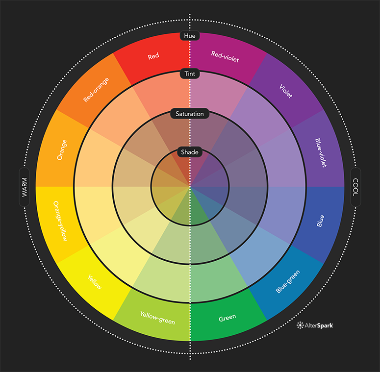
When light comes into our eyes, responsive cells called cones and rods figure out what it means and tell our brain about it. Rod cells understand light and dark (black and white), and cone cells understand colour, which is made up of three different colours.
There are three kinds of cones. There are short-wavelength cells (blue), middle-wavelength cells (green), and long-wavelength cells (red).
To keep things simple, I’ll just call the different cones by their colour name instead of their wavelength sensitivity. Just remember that these red cones have nothing to do with the colour red, which is kind of funny. They react to colors that our brains think are red. The red cones aren’t even red. It’s all in the mind.

Red simulates the posterior hypothalamus and therefore the sympathetic nervous system. Red and yellow provoke anger. All colours in the red spectrum – from red/orange to yellow, have a stimulating effect.
Colours which stimulate the circulation, such as red, orange and yellow, will exert qualities of heat. Heat expands and relaxes muscles, loosens tension and soothes pain. However heat may aggravate inflammation.
Blue stimulates the anterior hypothalamus, which contains the main regulating part of the parasympathetic nervous system. This means that all colours in the bluish spectrum, from blue/green to blue and violet, normally have a sedating, digestion – activating, sleep – inducing effect
Colours provoke emotional feelings and they are part of everything, from nature and rainbows to man made creations. Colours have a physiological, psychological and social impact on a personʼs health, wellbeing and status in the world; from the positive stimulating effects of warm colours, to the mental relaxation and soothing effects of cool colours.
It is said that colours set the mood and tone of an area by affecting our feelings and how we understand the symbolic meaning being shown. It is a way to show how you feel and express yourself, and it is known to be biologically attractive. A lot of research has been done on the link between colours and the human body. Colour is thought to be the combination of energy and matter. Light is energy. Each colour has its own range, frequency, and amount of energy.
As Einstein put it, the human body works in harmony with the universe’s electromagnetic and energy system.1.”Everything in life is vibration,”
Albert Einstein
Let’s say you have a very distinct brand with a bright yellow logo. If you post the logo on Facebook, Twitter or your website and don’t use the correct colour process, your logo will appear muddy instead of that bright yellow. That’s why, when working with files for any screen, use RGB, not CMYK.
Understanding and applying colour theory helps artists, designers, and marketers create visually appealing and effective works by leveraging the psychological and aesthetic impacts of colour.
But really, why should you care about colour theory?
Simple: branding, marketing and sales.
With this basic knowledge about colours and colour schemes, you’re prepared to make effective branding decisions. Like what colour your logo should be. Or the emotions that colours evoke in a consumer and the psychology behind colour choices on your website.
Think it doesn’t matter? Take a look at this article on colour combinations from hell. It just hurts.
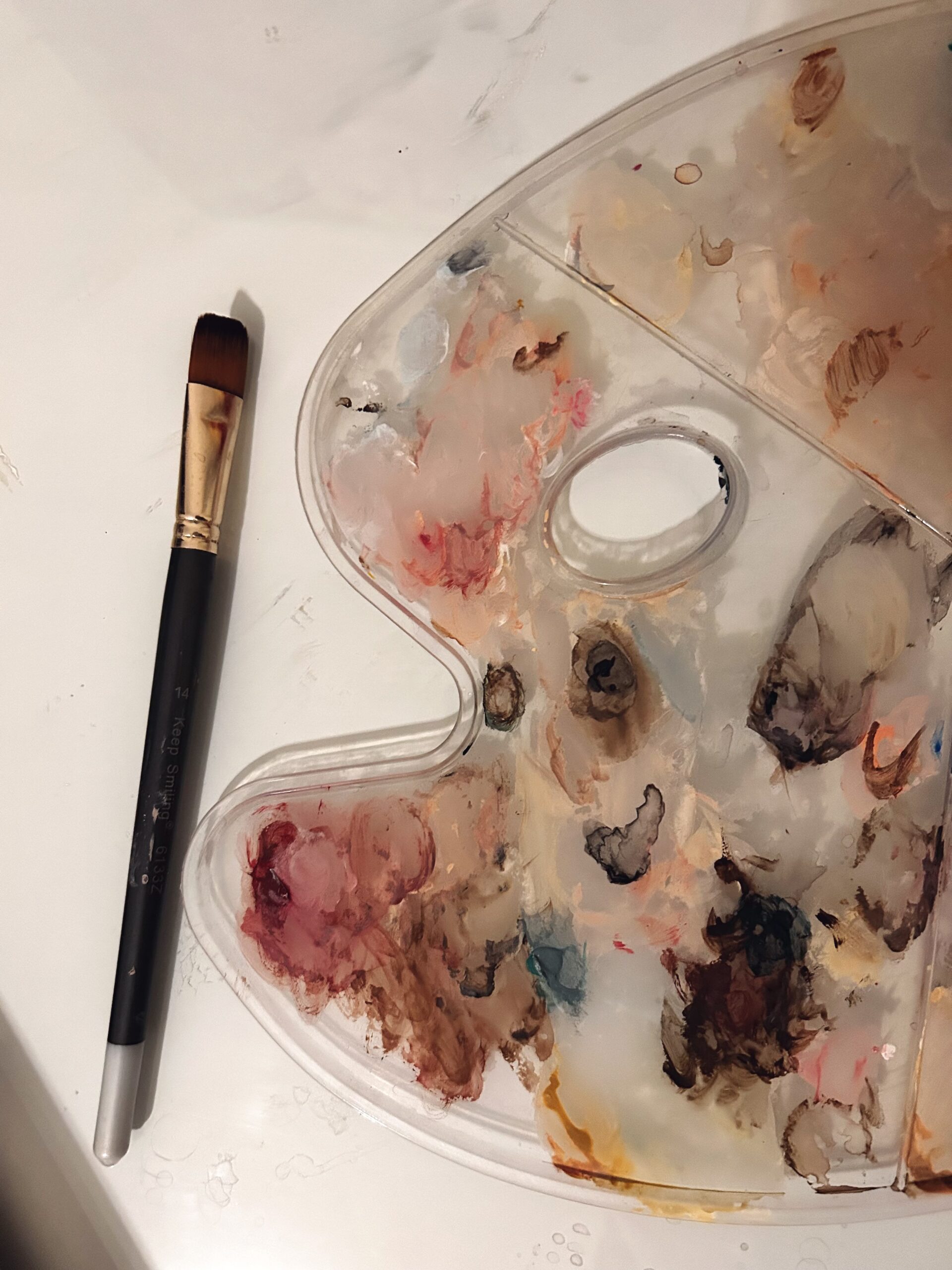
Part of my process at Find Me Lettering, all my clients receive their brand package in two folders, RGB an CMYK. I always create in CMYK first and then convert in RGB. CMYK has “smaller range” of colours and always can be presented in RGB mode. But if you make something in RBG ,in the original, it will look great on monitor, but some colours range which exist in RGB mode can not be correctly presented in CMYK mode. My clients will have problem, with missed colour tone, when he/she try to print it on printer or any other machine, almost every machine works on CMYK colour mode.)
Our client’s logo will not always be in full colour on a white background so it’s important to provide a variety of options for different scenarios. If their logo is going on a dark background, they will need an inverse or white option. If they can only print one colour, they may need a solid black version. Depending on the nature of the logo itself, you may have more or fewer versions.
Our clients receive all kinds of file formats out there but giving a client too many options can overwhelm them. These file formats are the ones that will meet the majority of client needs:
- Adobe Illustrator (AI)
- Editable PDF
- EPS
- SVG
- JPEG
- PNG
Putting together a logo package for our clients is a MUST process and some of it might feel like overkill. However, you have to remember that our client is likely not as familiar with graphic files. Keeping things labelled and organized will make it easier for them to use files correctly and navigate what is what. It will also save us from having to answer questions about what logo to use down the line.
If you need a Brand Refresh then you may want to take look at our two packages, the Pocket Brand and our Full Brand Suite, which are most requested packages and we love the process of working closely with our clients to develop their vision and authenticity.
Extra Reading Resources: