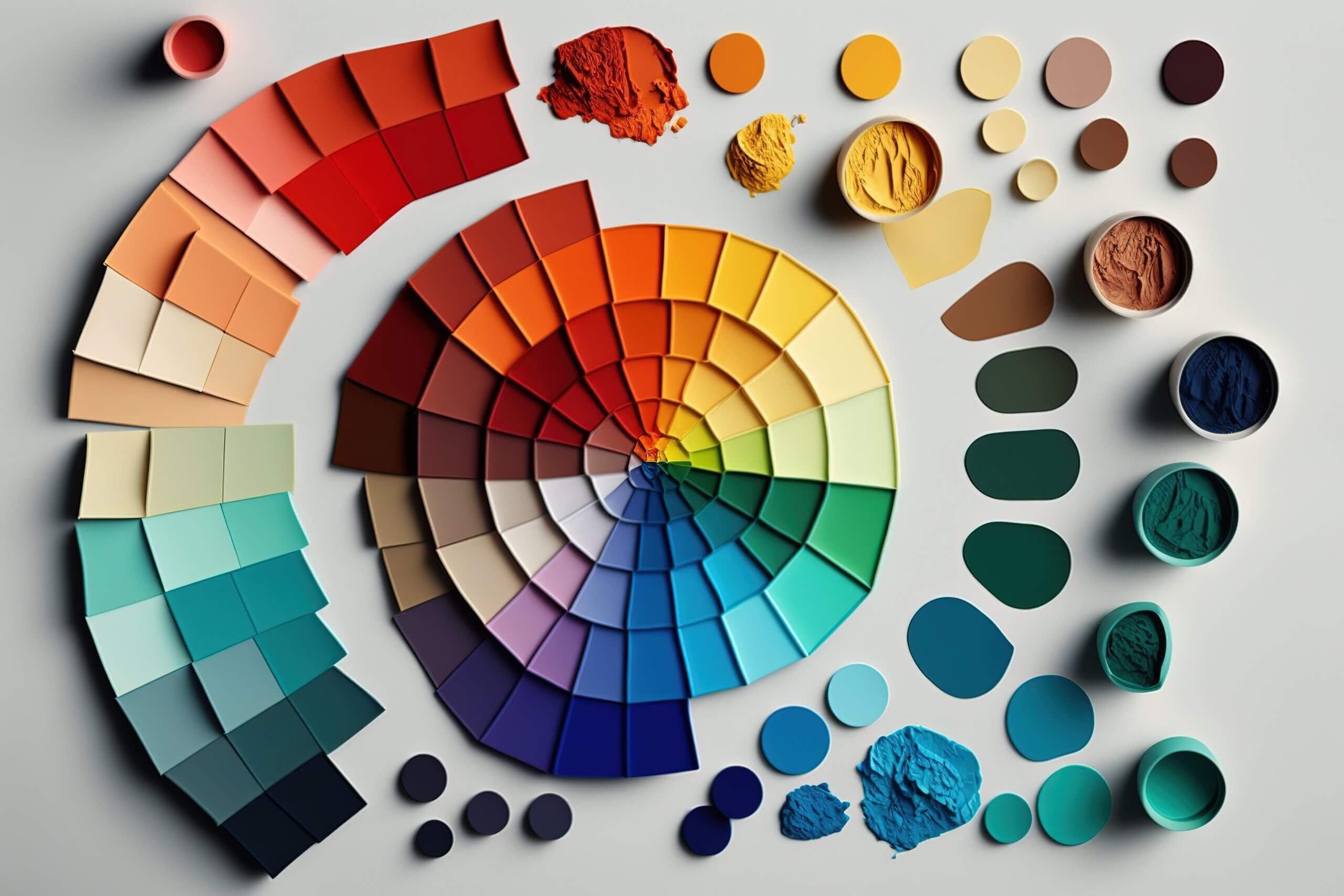
What’s your colour harmony?
Different colours mean different things, and it’s good to have an idea of what colour schemes are often used in your industry. But take note as a specific colour can mean more to someone or it can relate to religion or culture.
Your brand voice also represents the message you want to convey. It can be anything from luxury and sophisticated to friendly and relatable, informative, or bold and sassy. Understand the colours used in your industry and adapt.
Let’s start by understanding colour psychology, which is important as it determines the harmony it can provide. Colour harmony is the theory of how different colours work together to form a colour scheme or palette.
Did you know your choice in colour affects genders and culture?
VISME explains this so powerfully in an infographic, I have to share it with you.
What do we mean?
Ever associate a colour with an object or a brand?
#Homedepot and its bright orange? #slack #fedex #mastercard etc. The choice of colour has to impact the intended target market. So is your target market mums and babies, young couples, first-time home buyers etc.
In many Asian countries, red is a lucky colour associated with good fortune and money but in other countries, it can also be associated with warnings, blood, health problems.
Just like culture, gender also has a big impact on colour meanings. Gender colour stereotypes start to affect our perceptions at a young age. But recently, there have been gender-neutral colours that can influence any kind of consumer. I like the colour blue on a girl, and young boys are incorporating florals on their T-shirts.
Becoming gender-neutral, you will give everyone an opportunity to be your target market, not but in the future.
So which colour attracts your target market?


