

Does your brand adapt to the season?
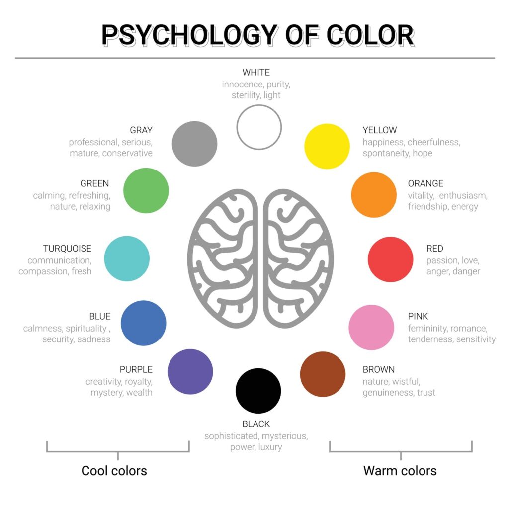
Here is a Colour psychology for your brand colour palette
In the Northern Hemisphere, we flip our wardrobes seasonally as we transition into that season. While it can be exciting, it can also be daunting as we embrace a new season, and it can cause stress. The transition is similar when I think of brands and businesses. So why not adapt your brand and its palette seasonally? In this blog post, we’ll talk about what timeless design really means and how you can get this look in your own business and brand.
Here are a few questions to assist you start thinking about your brand colours; these are just a small sample of the kinds of questions I ask my branding clients. I am also going to show you how this can be done.
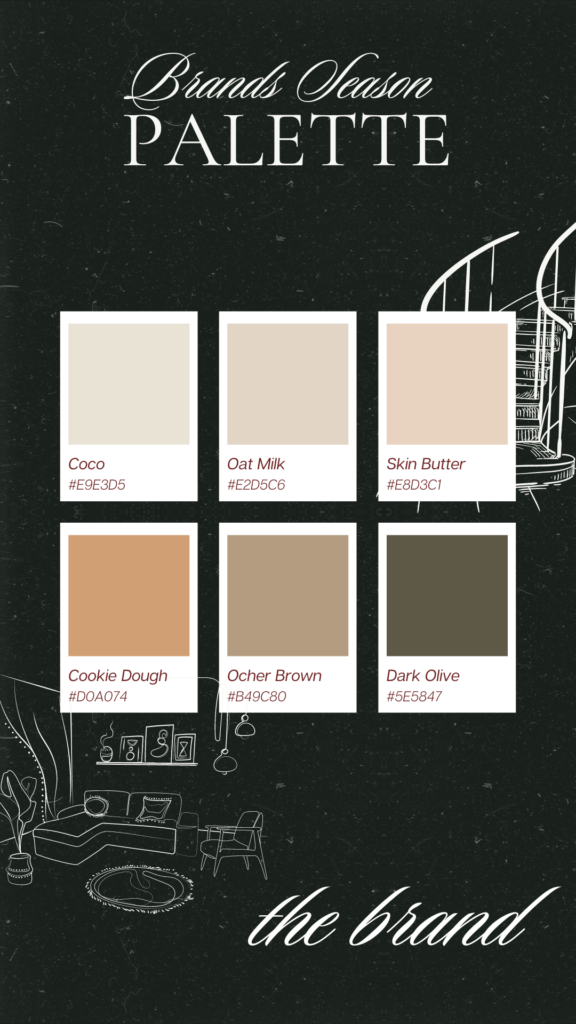
What is your ideal colour palette consisting of four or six colours?
This is merely a point of reference for you as we proceed; my goal is to gauge whether your present understanding will begin to coincide with what we cover in the post.
Two, in three words, describe your brand.
For example: luxury, modern, whimsical, refined, ethereal, contemporary, sparse, cozy, carefree, elegant, earthy, etc. It’s also OK to conduct more Google searches.
Tell me three things that define your brand.
Examples include steadiness, awareness, reliability, ease, love, aspiration, equilibrium, elegance, etc.
Which season best describes your brand?
Below, I have chosen to work with an interior brand that offers flexibility in decor and uses the opportunity of seasons to kit out homes and spaces.
Neutral colours, like soft greys, creamy whites, and sandy beige, are great for making a background that is understated and classy so that other parts of your design can stand out. As long as your walls, cabinets, curtains, and rugs are mostly neutral, you can add brighter/pastel pops of colour to decorations and other design elements. You can change these whenever you feel like the design is getting old.
Now, let’s look at the Brand in seasons. A seasonal brand inspiration can allow for a springboard to be added to a design, especially regarding colour. Seasonal design can also allow you to transition or rotate your décor throughout the seasons.
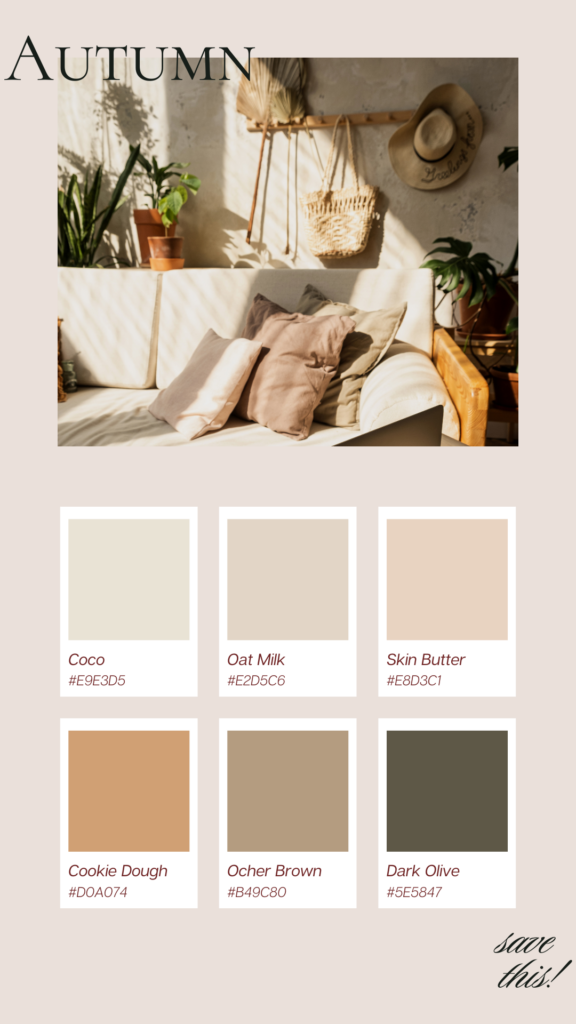
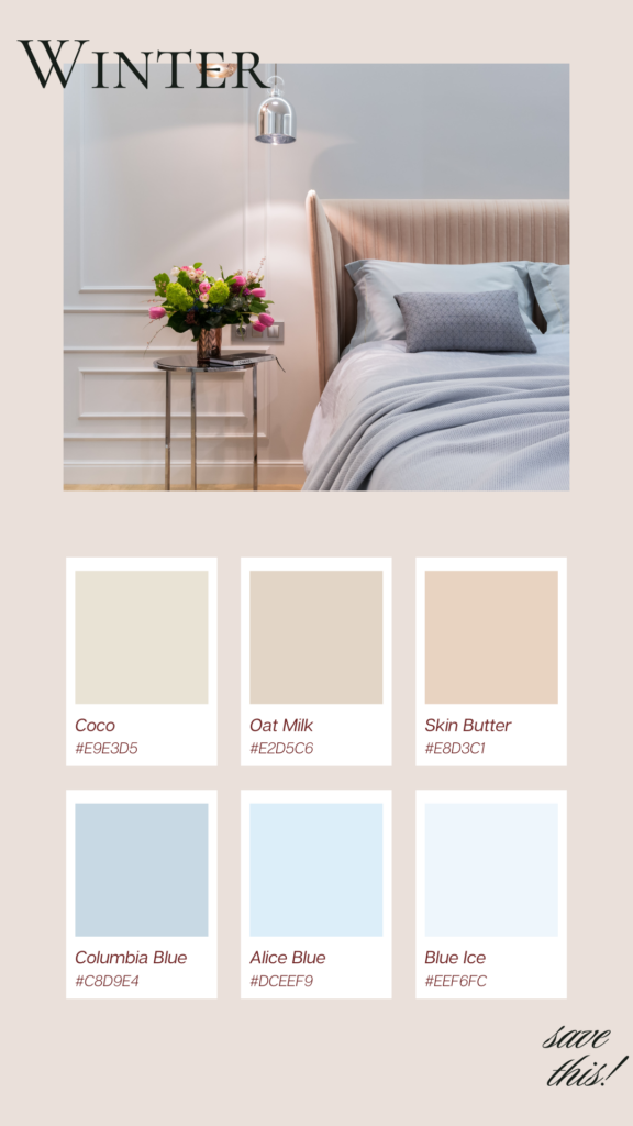
Perhaps this may seem a little excessive to some, but I believe that switching out some of your soft colours on a seasonal basis is a fantastic way to ensure the brand maintains a feeling of timeless style and a continual sense of harmony with the wheel of the year. When transitioning from autumn to winter, there may be significant differences, but maintaining three colors that are consistent with the brand is essential.
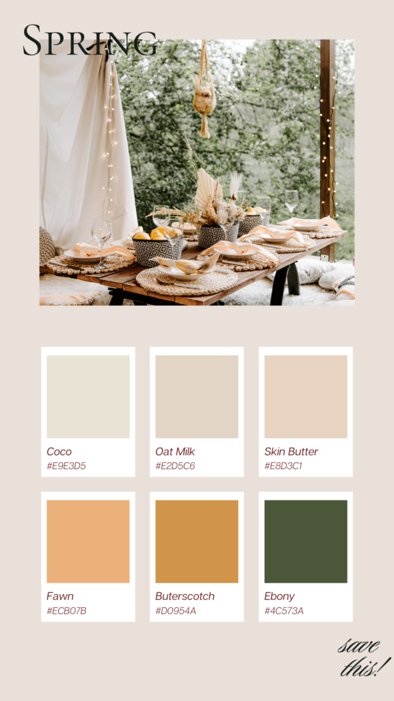
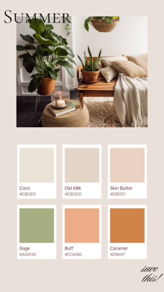
Now, let’s look at the Brand in the Spring and Summer seasons.
When it comes to interior design, trends come and go in the blink of an eye. Your own likes and preferences will also change and grow over time. If you choose a timeless interior design, your style can change with the times while still feeling sophisticated and classic.
Just because you like summer design doesn’t mean you can’t try out new styles and see how they fit with your own as they develop. Really, the whole point of this method is to make your brand enjoy new styles and trends in a way that is adaptable and long-lasting.
By choosing this approach to your brand and design, you can make your brand feel less repetitive. I read an article by House & Gardens on Seasonal colour analysis for apparel that initially appeared in the early 1980s, shocking everyone. Carole Jackson, a professional colour consultant, popularized the concept of seasonal colours in her best-selling book Color Me Beautiful, which is where it all began.
Rather than being a rigorous scientific procedure, seasonal colour analysis was more of a practical tool in those days. In the 1980s, the coloured (if you can call them that) would hold up a stack of fabric swatches or colour samples to their face to see how each colour would look. Now, it’s all digital and done from a person’s photos. If the shade is off, the wearer’s complexion will look sickly and lifeless. If you do it correctly, they will seem radiant, healthy, and happy.
Choosing colour analysis for your business and/or personal brand is important, so if you want to get started, reach out to me, and let’s pick the colours that best complement you.