

Let’s talk about fonts, typefaces, handwriting, and hand-lettering today. Now, I don’t think you must know this, but I do believe it is important to know the differences and get a better idea of font combos and how to use them in your brand. I’ll explain what makes them different, how they go together, and what I think is best for your brand below.

TYPEFACE
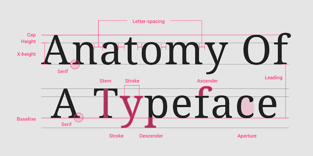
An authentic style is a typeface. It is how the characters look (their shape and style). The typeface family could also include different font versions, such as bold, italic, etc. A typeface is a collection of letters. While each letter is unique, certain shapes are shared across letters. A typeface represents shared patterns across a collection of letters.
THE TEXT OR SCRIPT
The difference between writing and calligraphy or script is that: Calligraphy is simply writing with strokes of a pen or tool. Each letter comprises up and down strokes with a certain amount of weight applied. It can have glyphs (in some designs) and is usually more fluid than hand lettering.
FONT
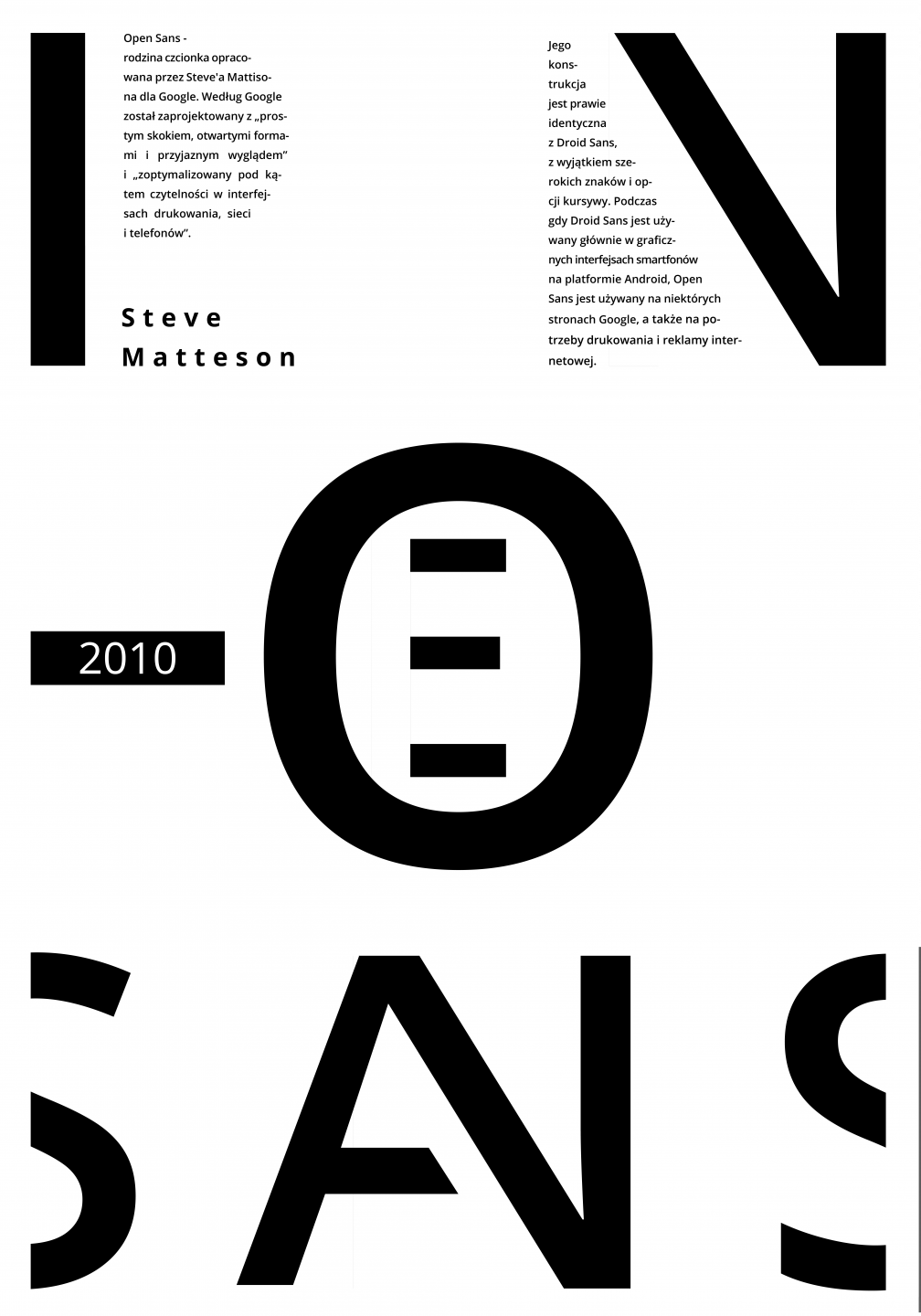
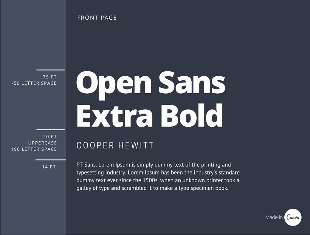
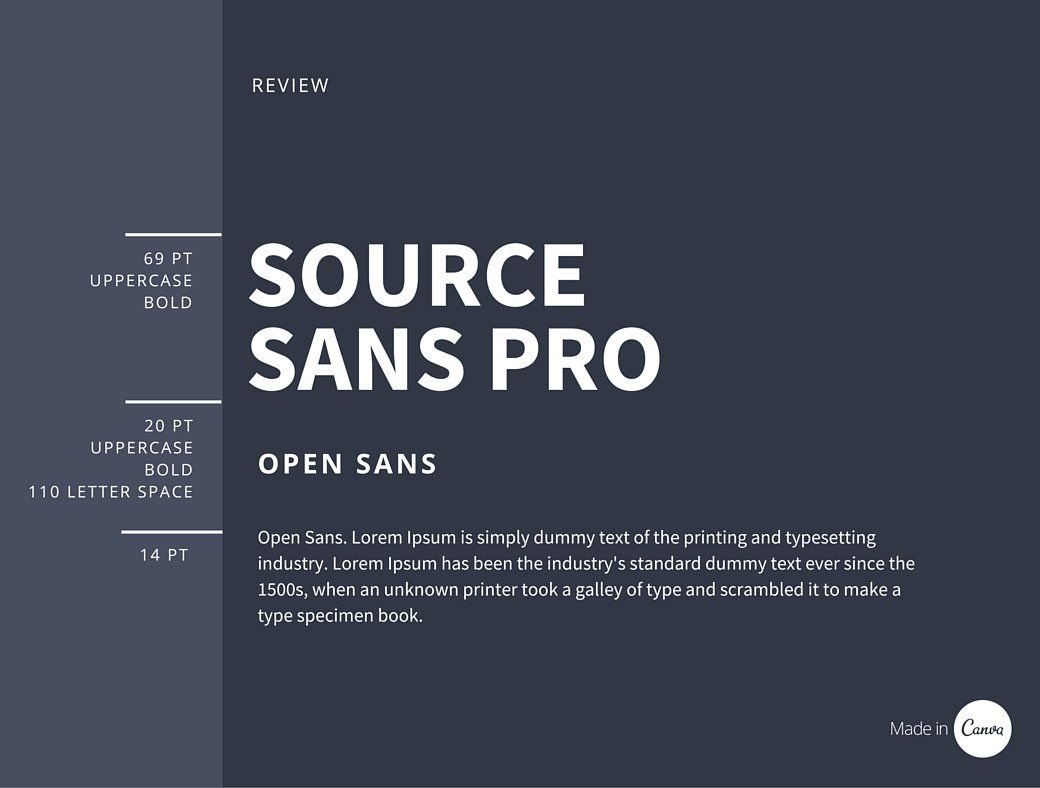
On the other hand, a font is a set of digital or printed characters with a particular style and size. For example, the typeface family is Open Sans, the typeface is Open Sans Italic, and the font is Open Sans 10pt.
LETTERING
Lettering is an art, just like calligraphy, but it involves making letters. It is generally made up of letters designed separately but together to make a whole. Each word is made up of a unique combination of letter shapes.
So, what are the different types of lettering?
-
Sans serif
-
Serif
-
Cursive / Script
-
Vintage
-
Gothic – Blackletter calligraphy
-
Graffiti
-
Creative Lettering
-
Other sub-lettering styles
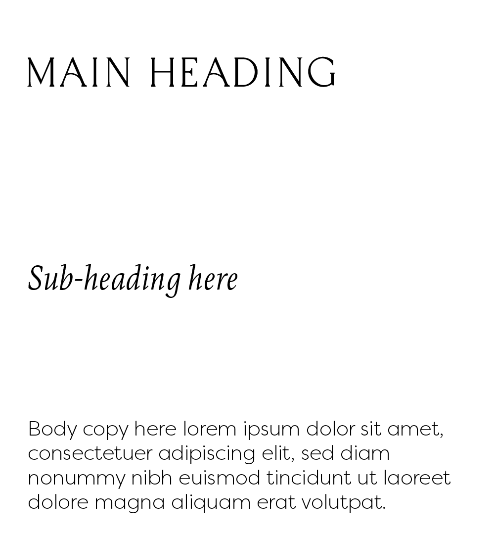
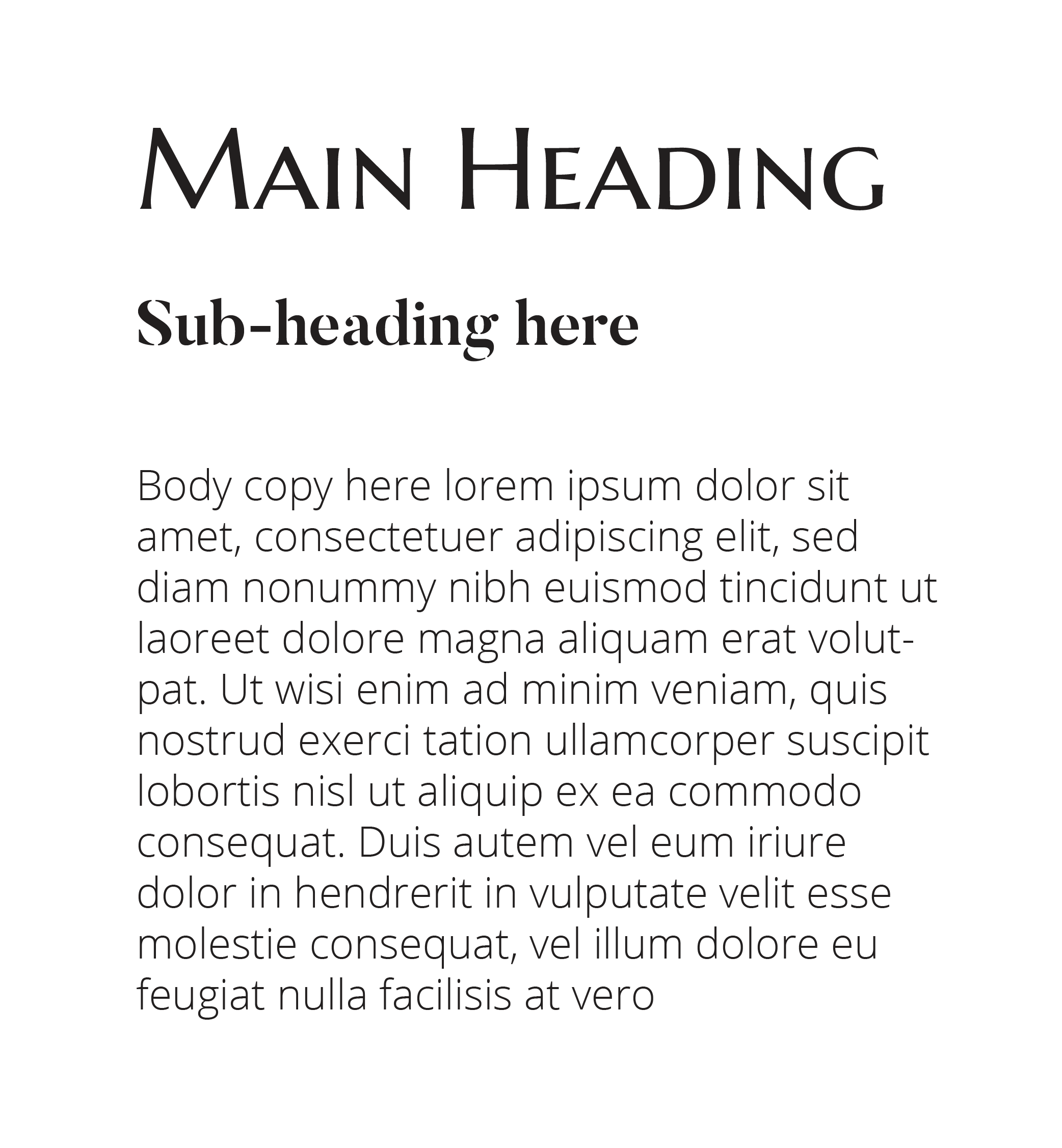
As you can see in the examples below, when mixing fonts, try to stick to two at most. When it comes to marking, the more styles you use, the busier and messier it could look.
FONT PAIRINGS
Here comes the fun stuff, which is where you should pay attention! When it comes to your brand, using the same fonts together is essential. Not only will it help keep things clean and uniform, but it will also help set your brand’s style since different typefaces give off different vibes and feelings.
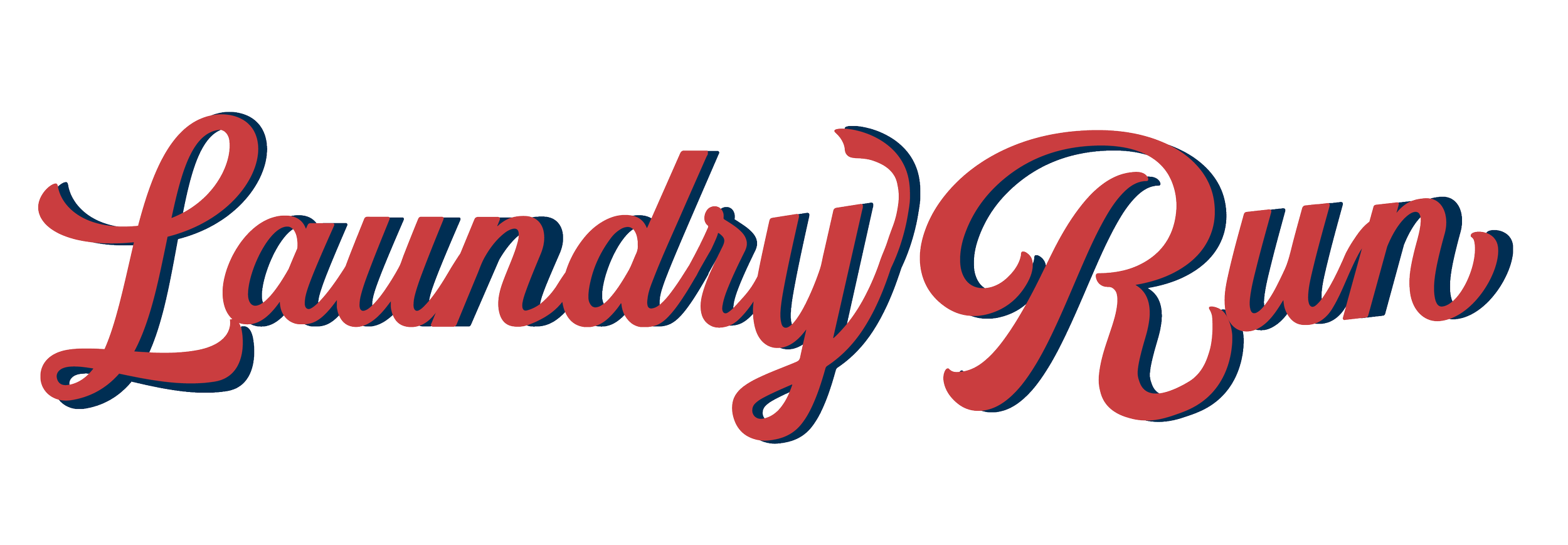
MY PAST PROJECTS
When making a whole brand, I like to use no more than two or three typefaces unless one is more creative or unique, like handwriting or hand-lettering. When you add too many, it gets pretty messy.
When I use calligraphy or hand-lettering in a mark, I sometimes choose three fonts that fit the style. I don’t usually suggest using scripts for major headings because they can be hard to read on a blog or other website. Use this script style instead for headings and specific words that tell people what to do. Because of this, I’ll pull in two font combinations that match the name and can be used with it. For example, my logo has some hand-written writing, but I only use that as a small detail here and there.
Check out Google fonts if you want to create and use fonts on your website, or reach out to us for some help with your style and layout.