I am your brand and marketing curator who will help you and your business land creative solutions with custom projects. I help you create your own story, one that is aligns with your brand, your style, and your ideal customers and viewers.
free guide
Dreaming of Your Own Brand?
Take the first step with a roadmap that turns visions into reality.
Create beautiful, on-brand newsletters. Use my code: FINDME and get 50% off today!
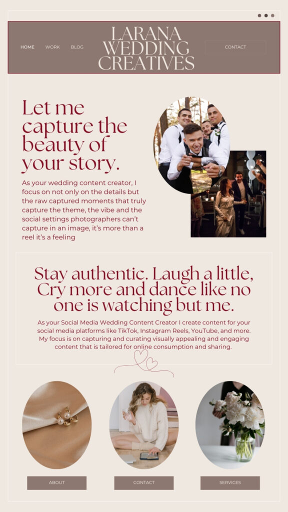
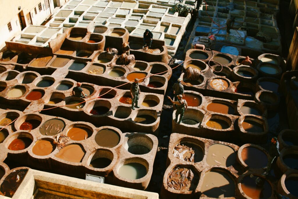
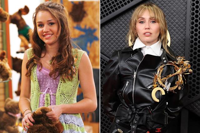
My arch nemesis has to be the wedding industry market and especially photographers who capture the most beautiful imagery and photoshoots that drop my jaw.
And don’t get me started when they capture that perfect shot. I’m talking about fireworks as the couple officially kiss. Yes we have all seen that video and image if not you can see it here.
You might feel the same about your brand and social media. Most entrepreneurs do. “Choosing a font or style is fine; it’s creating the social media posts that support the brand without deferring to being cutesy, or colourful (or whatever your brand arch-nemesis happens to be).
You might think you have a social media problem when actually you have a branding problem.
On a deeper level, you might think you have a branding problem, when really you have a brand confidence problem. Do you get where I am going with this?
Let’s understand the use of logo and colours in a luxury brand.
It’s probably not news that you need to really understand your customers. This is a necessary part of any brand development plan, it’s even more important for luxury brands to understand this because the market is shifting from physical goods to experiences, hopes, and ways of showing who you are.
What makes these people do what they do? What language do they speak, where do they live, where do they have fun, get knowledge, and spend their time? In our busy culture, even time can be seen as a luxury.
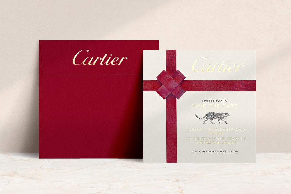
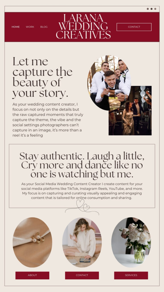
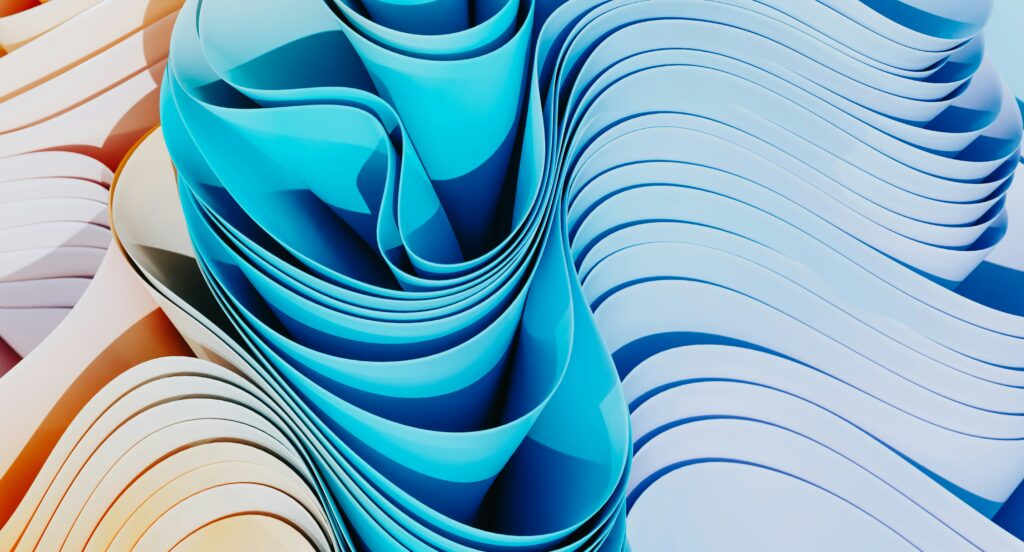
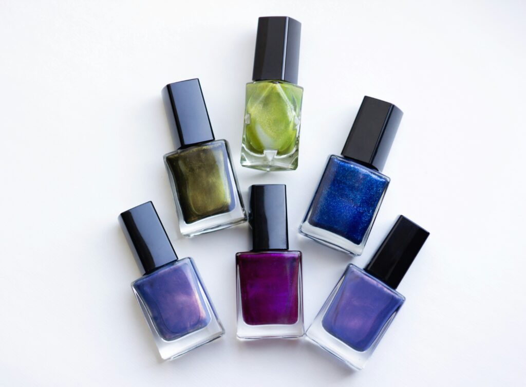
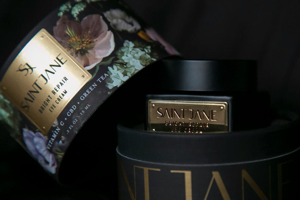
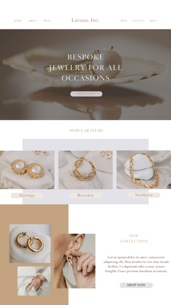
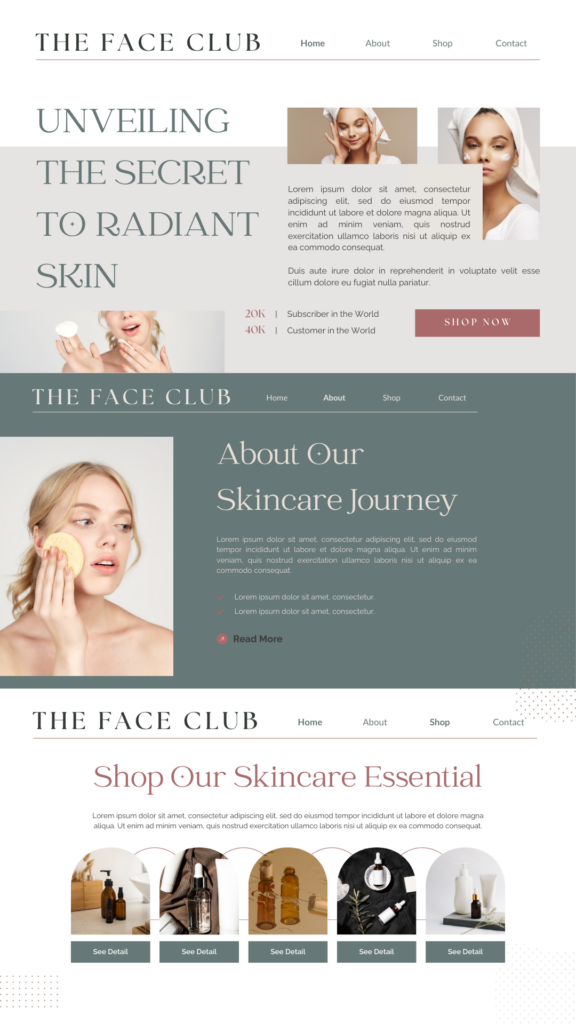
I’m going to share an example of my client who chose a luxury brands colours for her own website:
The Inspiration
The Look
Through the conceptualisation of this brand, it was important to keey in mind the luxury feel and the audience who they are talking to.
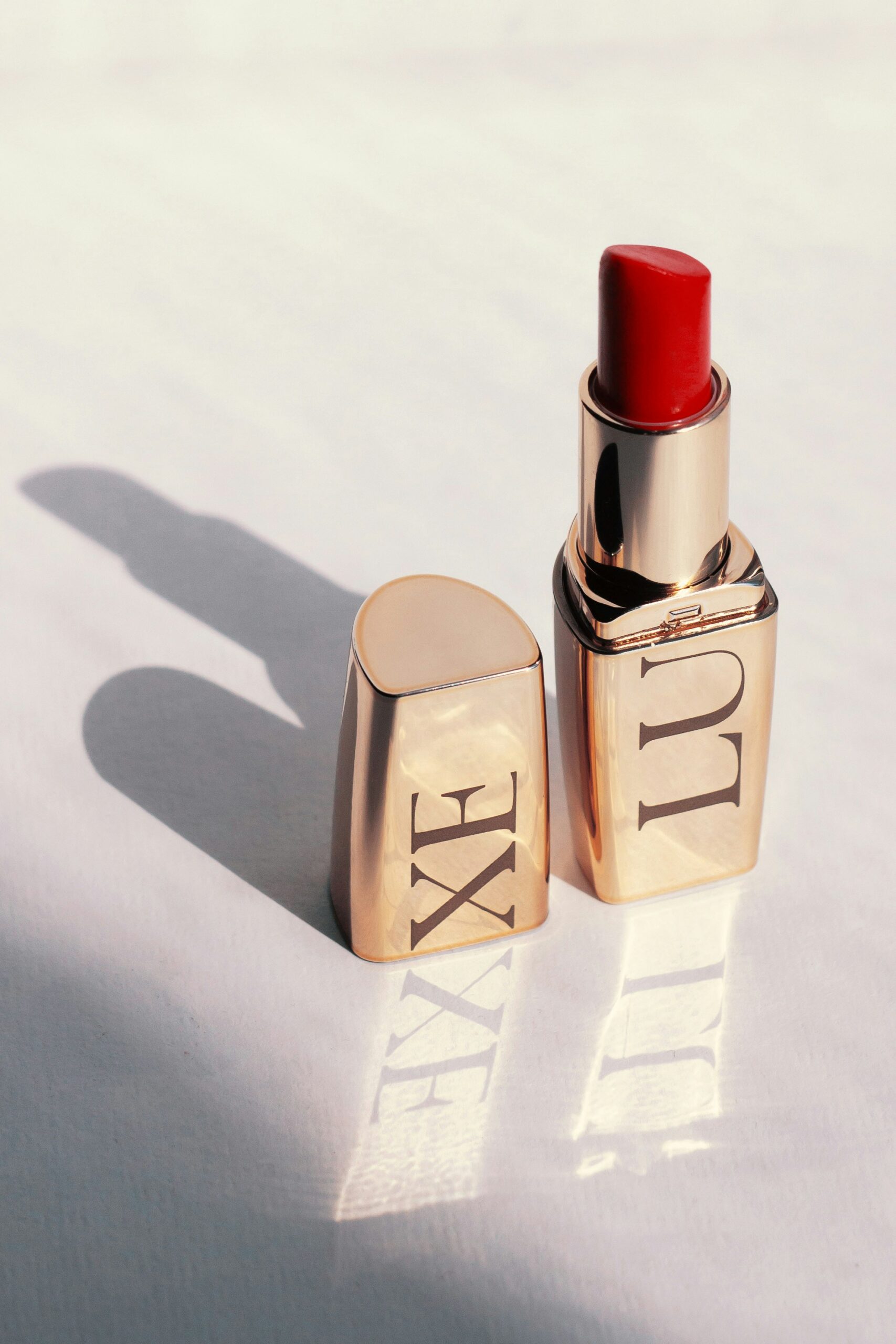
Red
Red is the most attention-getting colour because it shows fire, urgency, and life. When it comes to branding, red is a strong color that makes people feel a lot of different things, from energy and desire to caution and importance. Its strength can wake up the senses, speed up the heart rate, and even make someone want to do something.
In branding, red often means confidence, bravery, and determination. In history, red has been linked to love, danger, and power. This colour can show that a brand is innovative, leading, or ready to change things. Red is a lively color that people who want energy, passion, and effect will connect with, whether it’s used to draw attention to a sale, make people feel like they need to act quickly, or build a strong brand identity.
Let’s look at a couple other colours
Orange
When you mix the energy of red and the happiness of yellow, you get orange, which is a colour of energy, creativity, and love. Orange is often used in branding to get people’s attention without being as intense as red. This is because orange is both energizing and friendly. Feelings of thrill, adventure, and a zest for life come to mind.
Orange is also linked to movement and change, and it’s often used to represent transition, new ideas, and looking ahead. Brands that use orange want to show that they are friendly, sure of themselves, and have a new point of view. Orange is a strong colour for branding that connects with people who want a mix of energy and friendliness. It can be used to show off new ideas, make things more colourful, or build a sense of community.
Yellow
Yellow is a colour of hope, energy, and brightness that stands out because it is warm and bright. And when it comes to branding, yellow stands out and makes people feel happy, positive, and free. Its light can sharpen your mind, help you talk to others, and spark your creativity.
Yellow is often a sign of hope, freshness, and new starts because it is closely linked to the sun. Brands that use yellow want to show that they are friendly, easy to get in touch with, and full of young energy. Whether it’s the main colour or an accent, yellow can give a brand a new look that makes it stand out and be remembered right away.
Green
Green is a sign of nature, growth, and starting over. It makes you feel calm, healthy, and full of life because it comes from the surroundings. When it comes to branding, green is a flexible colour that often stands for balance, health, and sustainability. Because it is linked to nature, it is a popular choice for brands that want to show they care about the environment, use raw materials, or take a holistic approach.
Green’s calming undertones can also build trust and a sense of stability, making it a strong colour for businesses that want to show they are trustworthy and real.
Blue
With its deep and resonant tones, dark blue gives off an air of dependability, stability, and knowledge.
People from all time periods and modern times can relate to this colour, which makes them feel calm, trustworthy, and in charge. When it comes to branding, dark blue is a classic choice for businesses and institutions that want to show they are professional, honest, and knowledgeable. Because it never goes out of style, brands that want to build trust and stability in their field love it.
Purple and Indigo
Purple is in the middle, between the calm security of blue and the fiery passion of red. It has long been linked to royalty and mysticism. Its depth and richness can make you feel spiritual, creative, and pampered. Purple is a great colour for brands that want to show a sense of wonder, elegance, or the cutting edge because it stands for new ideas, luxury, and the ethereal.
It has a play on cansual meets elegance.
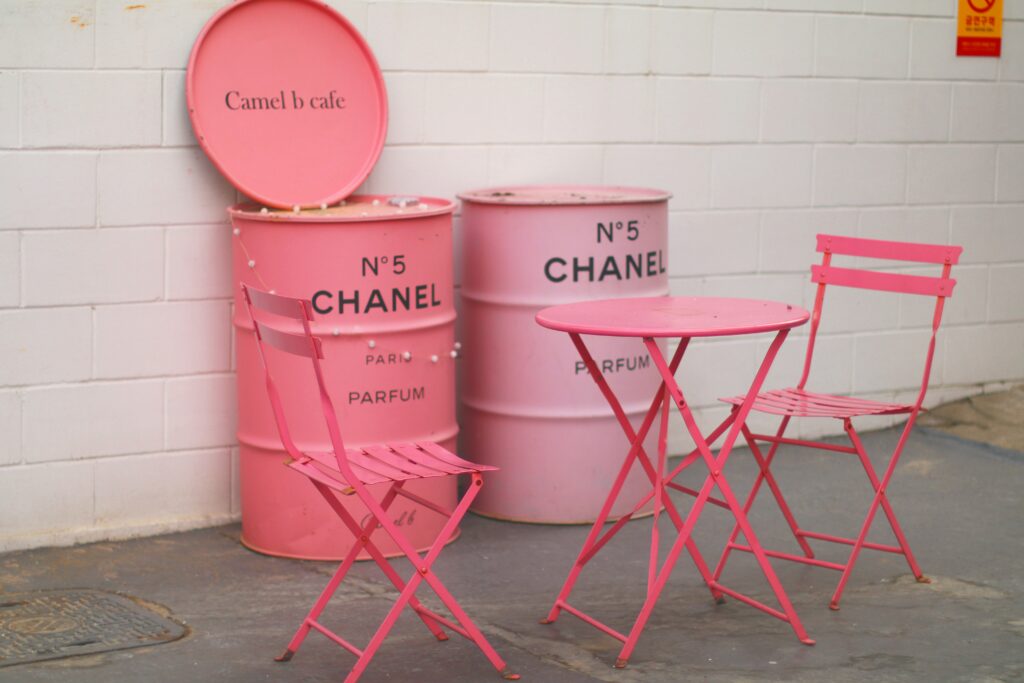
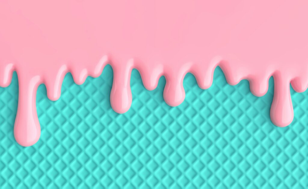
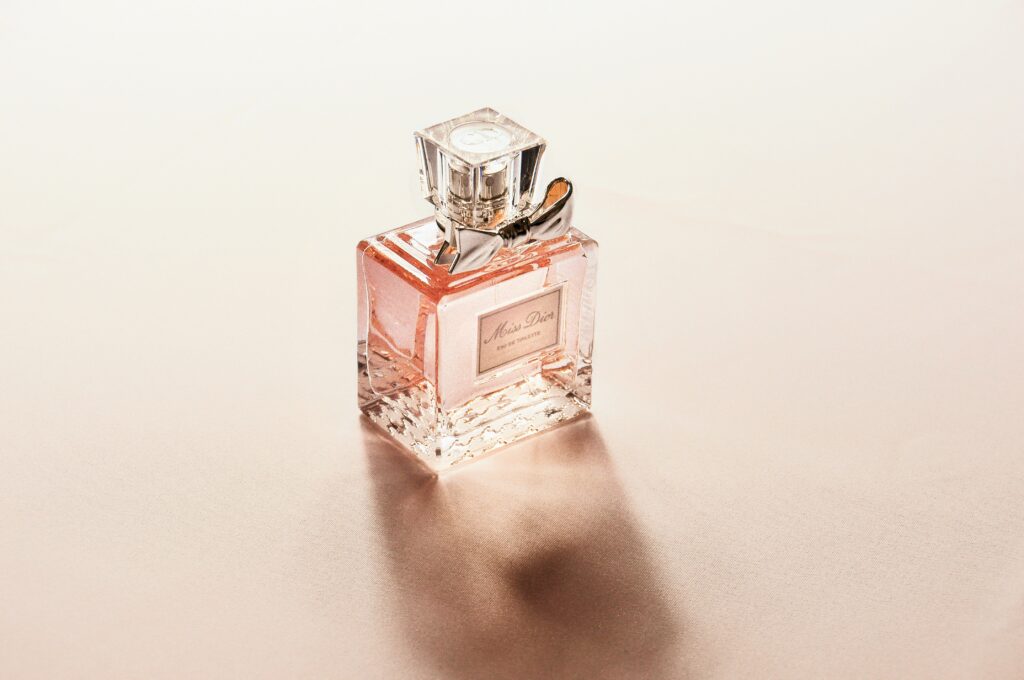
Pink
Pink is a colour that shows both softness and power. Its shades range from childlike innocence to lively energy. From soft colours to bright magentas, its range can make you feel romantic, feminine, and hopeful.
Pink can stand for a lot of different things in branding, from youthful enthusiasm to classy luxury. People are drawn to this colour, which is why brands that want to show warmth, friendliness, or current femininity love it.
Browns, Beige,and Nudes
Brown, with its rough and earthy undertones, stands for wealth, depth, and usefulness. Its natural warmth makes it warm and friendly, which makes it a favorite for brands that want to look homemade, artisanal, or masculine. Brown is a great colour for brands that are related to nature or craftsmanship because it shows dependability, longevity, and a handcrafted quality.
Gold
With its sparkling beauty, gold is often associated with wealth, success, and opulence. Its bright light makes you feel warm, successful, and wealthy. When it comes to branding, gold doesn’t just mean expensive things; it also means quality, history, and being the best in its field. Gold is often used to send a message by brands that want to appear important, traditional, or expensive.
Blacks and Greys
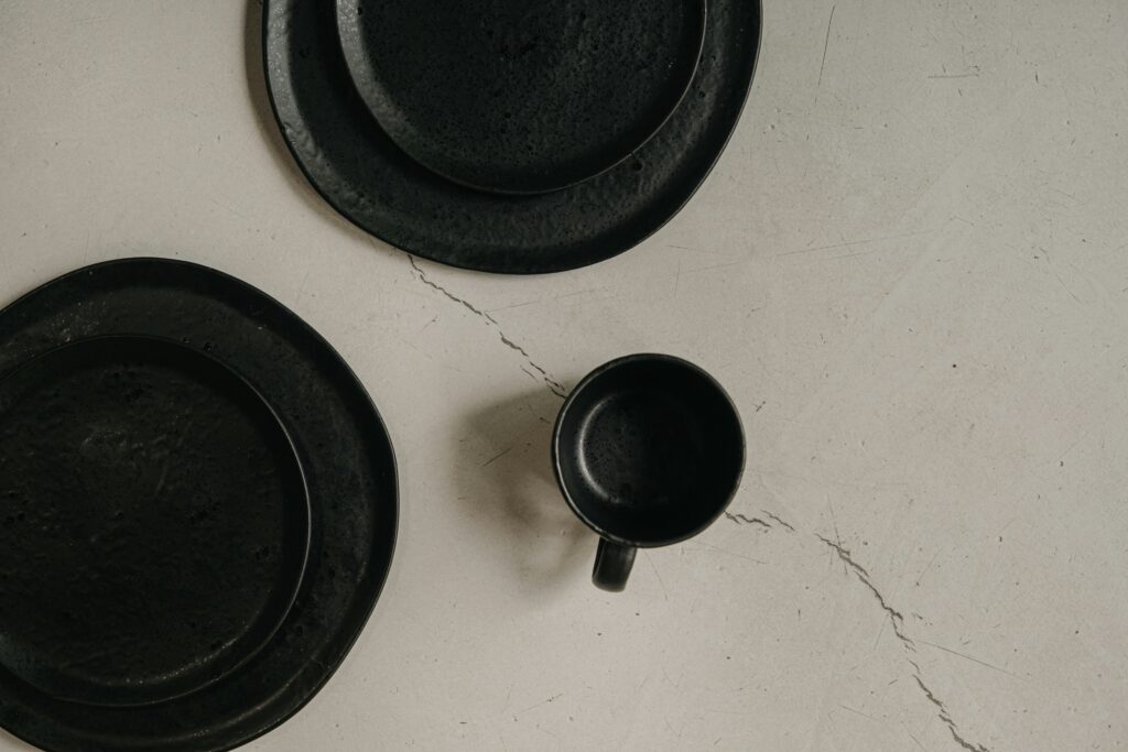
Black is a powerful and classy colour that is often associated with authority. This makes it a great choice for fashion, magazine, and luxury brands. Its classic and sleek look can make you think of sophistication and wealth, but it can also stand for mystery or even grief. Branding-wise, black is a sign of luxury, high quality, and confidence. This is why brands that want to stand out often choose black.
The colour grey, which ranges from soft dove to dark charcoal, makes you feel calm, neutral, and up-to-date. It’s popular in both tech and traditional settings because it can be used to show sleek design or wealth. When it comes to branding, gray is a good middle ground between bold and subtle, so it can be used for a variety of purposes.
Look at what each colour means. This should help you choose brand colours that are in line with your goals and values, as well as how you want people to feel about your brand.
I think a Brand review, even a clean-up or rebrand could be what you need to make showing up with confidence and cohesion easier.
You want to operate in the luxury market and secure those luxury weddings. You have the expertise, your passion is there, but your brand might be a little messy.
In Brand Clean-Up, we’ll focus on cleaning up your current brand identity with a colour palette, fonts, and logo refresh, paired with new shapes, IG templates, and co-created social media posts to match and amplify your vibe effortlessly.
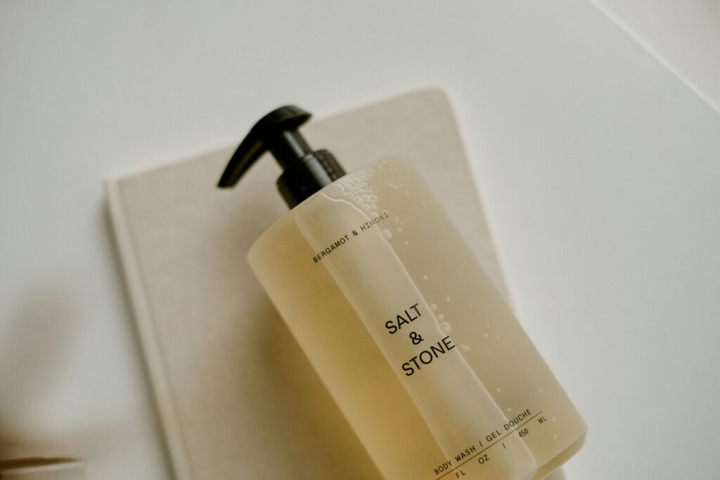
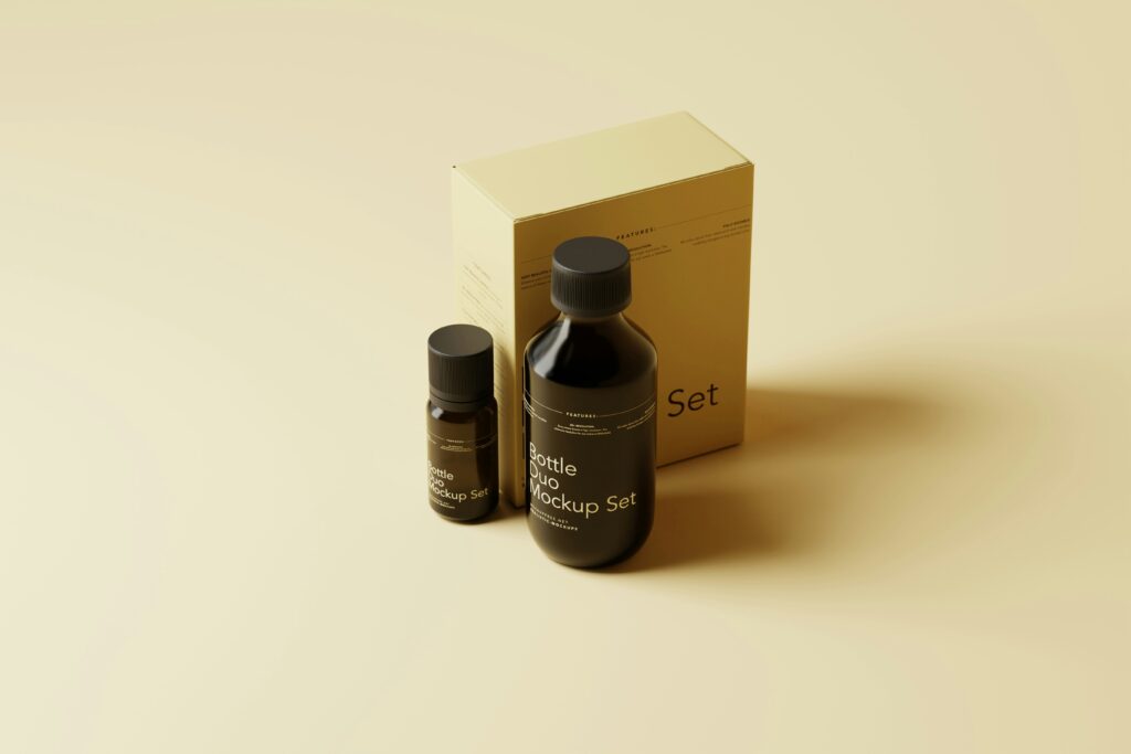
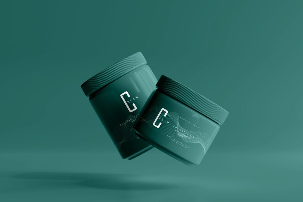
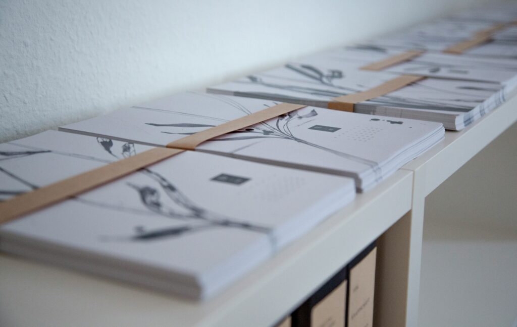
Product Samples and Layouts for potential clients looking to up-level their brand and website.
I am your brand and
marketing curator who
will help you and your
business land creative
solutions with custom
projects. I help you create
your own story, one that
is aligns with your brand,
your style, and your ideal
customers and viewers.
free guide
Dreaming of Your Own Brand?
Take the first step with a
roadmap that turns visions
into reality.