

Since I began my journey as a calligrapher, I have been mesmerized by Paul Antonio and his work. If you have ever taken a workshop with Paul, you know exactly what I am talking about.
Who is Paul Antonio?
Paul Antonio is a skilled artist renowned for his expertise in calligraphy, gilding, and heraldry. Born in Trinidad, Paul trained as a Heraldic Artist and Scribe before delving into the study and teaching of both ancient and contemporary calligraphy. His academic pursuits included a degree in archaeological illustration, with a particular focus on ancient writing systems.

His illustrated works on Egyptian Hieroglyphs are held by the Metropolitan Museum of Art in New York City. As a prominent figure in modern calligraphy based in London, Paul has been commissioned by many prestigious companies, including Asprey, Selfridges, and Bally. Additionally, he has shared his extensive knowledge of calligraphy through lectures at the British Museum and the Victoria and Albert Museum (V&A).
Currently, Paul resides in Portugal with his partner Tim. Together, they enjoy exploring their scenic backyard, filled with acres of orange trees and his favourite fruit, quince. Paul even makes a perfect quince jam, which I learned about over lunch.

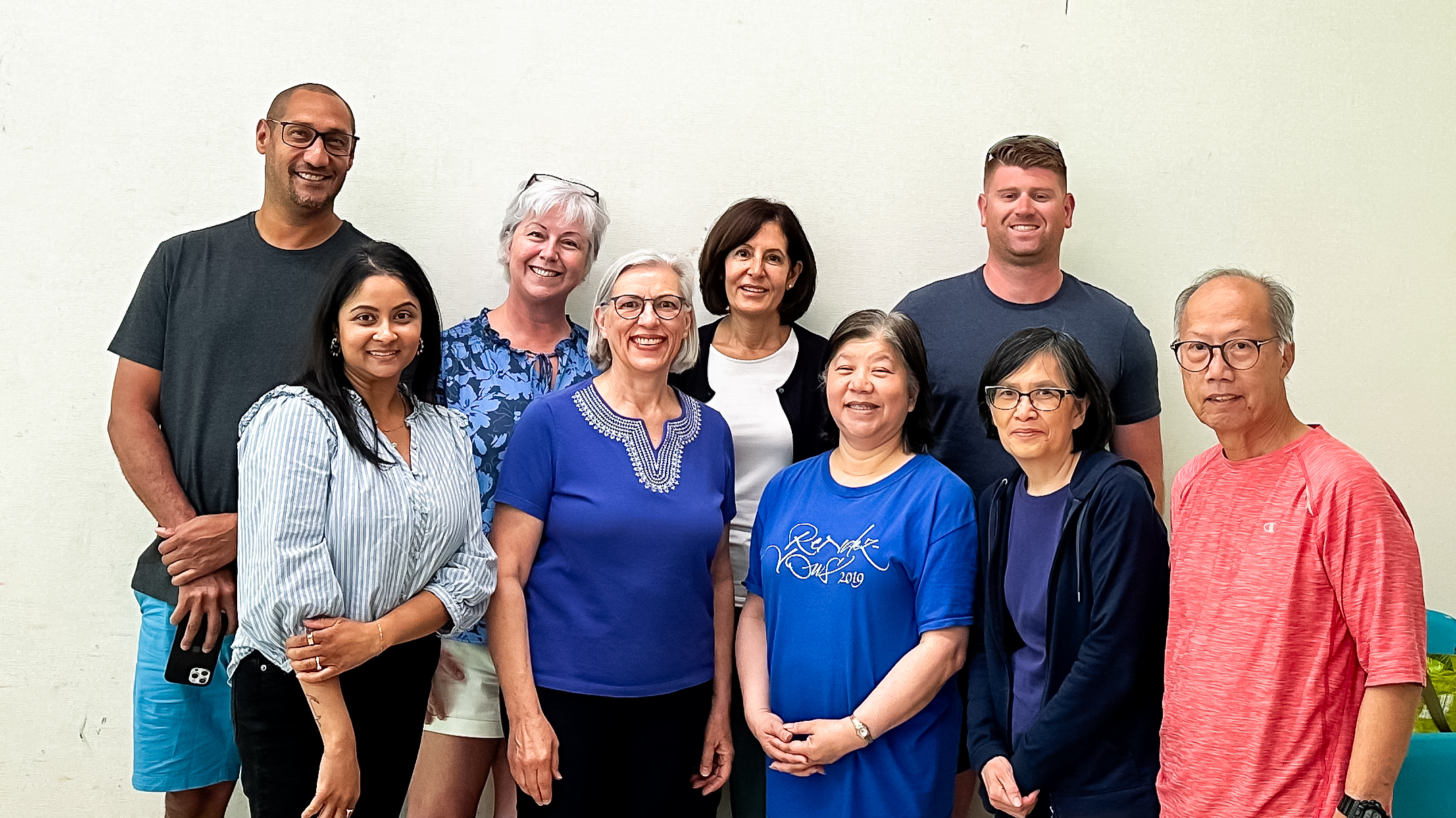
The Calligraphic Arts Guild of Toronto hosted Paul Antonio for a two-day workshop this June.
The Calligraphic Arts Guild of Toronto, Canada, is a non-profit organization run by volunteers for over 35 years. Funds generated from the membership, workshops and special events are used to further the goals of the Guild and its members. They aim to provide opportunities for the study of calligraphy, to foster a spirit of cooperation and sharing of ideas and techniques and to encourage public awareness of fine lettering as both craft and art. “The Calligraphic Arts Guild of Toronto is the oldest Calligraphy Guild in Canada”, according to Mark Lurz, a founding member.
It is such an opportunity to be part of this community.
Learning Spencerian Script
It may take me about 10,000,000 hours to be as good as him, but it was honestly the most beautiful font that lends itself to flourishing and ornamental drawing.
According to Wikipedia “Spencerian script is a handwriting script style based on Copperplate script that was used in the United States from approximately 1850 to 1925,[1][2] and was considered the American de facto standard writing style for business correspondence prior to the widespread adoption of the typewriter. Spencerian script, an American form of cursive handwriting, was also widely integrated into the school system as an instructional method until the “simpler” Palmer Method replaced it. President James A. Garfield called the Spencerian script, “the pride of our country and the model of our schools.”[3]
Platt Rogers Spencer, after whom the style is named, drew inspiration from various existing scripts and nature to develop a unique oval-based penmanship style that could be written quickly and legibly for business correspondence and elegant personal letter-writing.
Spencerian script is distinguished from round hand and copperplate scripts by the lack of emphasis on shaded downstrokes on most small letters and by the use of only one broad downstroke on capitals. Minuscules are considerably smaller than capitals, and the joins between letters tend to space them far apart. The emphasis on forming letters by arm movement and basing round letters on an oval sometimes leads to confusion between a, e, and o.
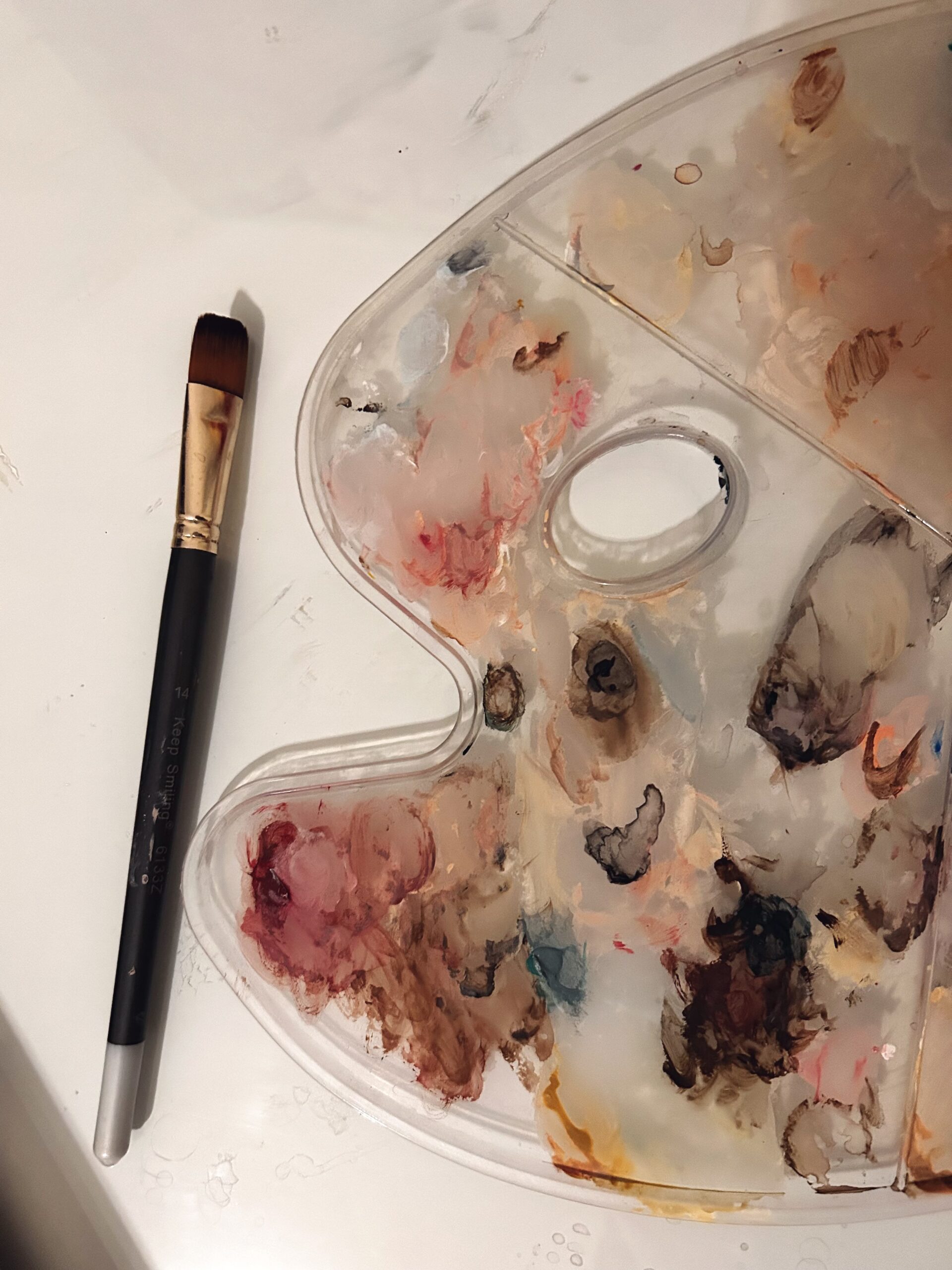
In simple terms, Specierian script is based on how lightly you can press up against a paper and only place pressure at the top or bottom of a letter. This was not easy, especially if you have been doing modern calligraphy for a while, as muscle memory makes you want to apply pressure. My work contains a lot of pressure work, but this style tests the pressure of muscular movement.
I had to throw whatever I had learned and adopt this new style by incorporating Paul’s highly recommended videos on Posture, Placement and Position. This was the beginning of so much more and after a day spent with Paul and learning these techniques of crafting this font, my mind was truly blown away.
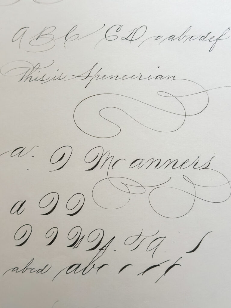
The Before and After
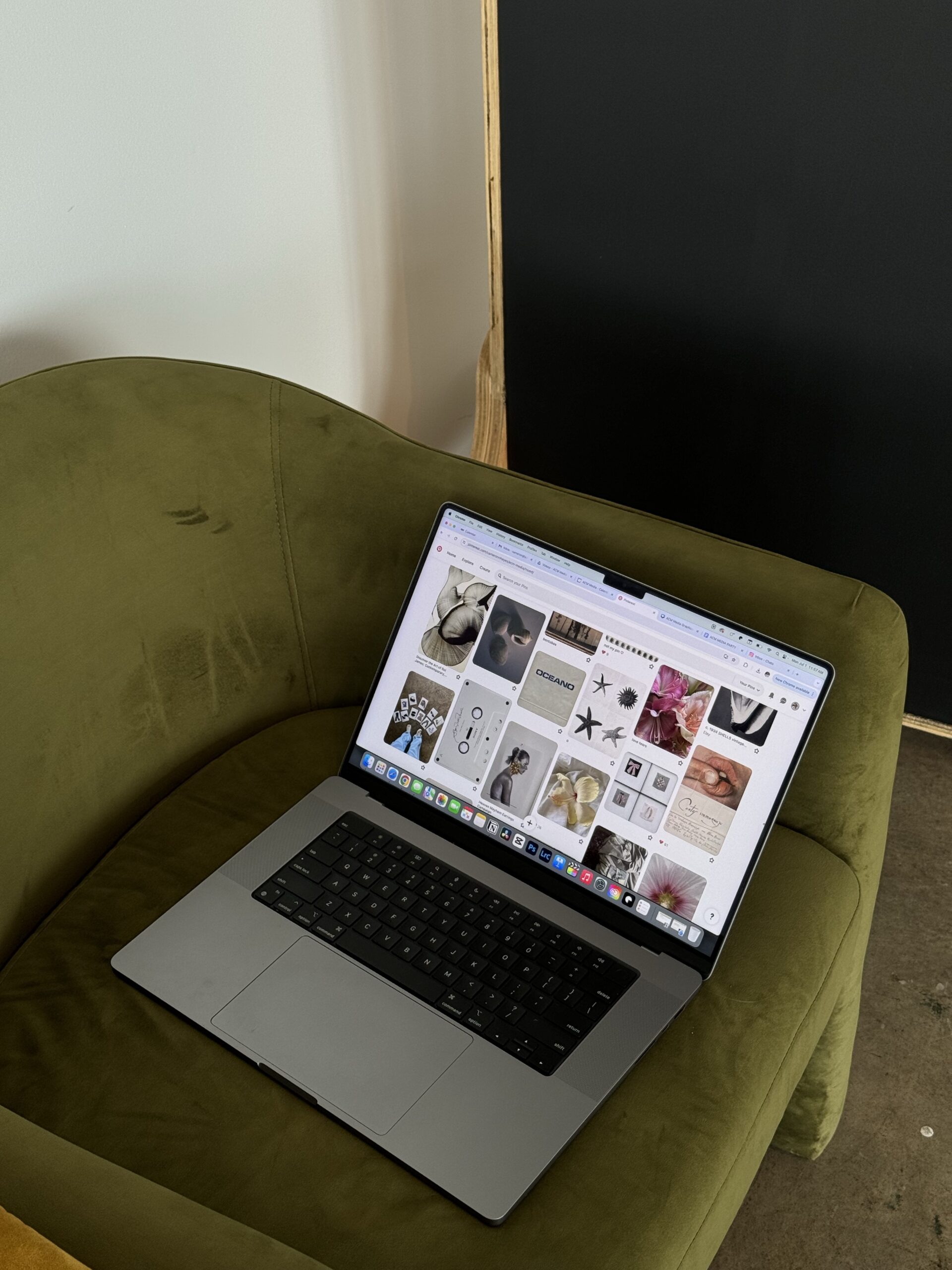
My learnings will continue by practicing and learning the most important techniques, as I will be incorporating these skills into my offerings, especially in creating Brands or Custom logos and Custom Work.
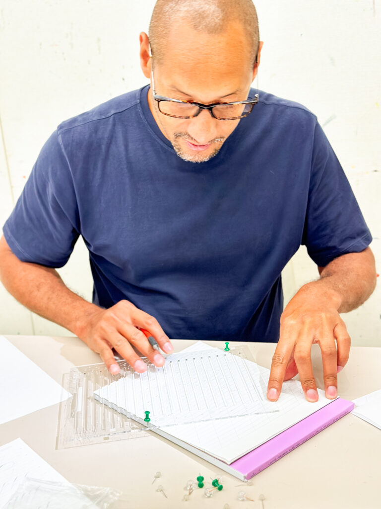
Below is a depiction of how the training began and eventually where I found myself at the end of day two. But image three is truly the master at work using my tools. Paul sat with us individually and I was able to see how he positions himself and holds a pencil and pen.
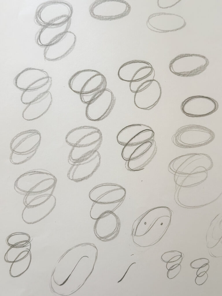
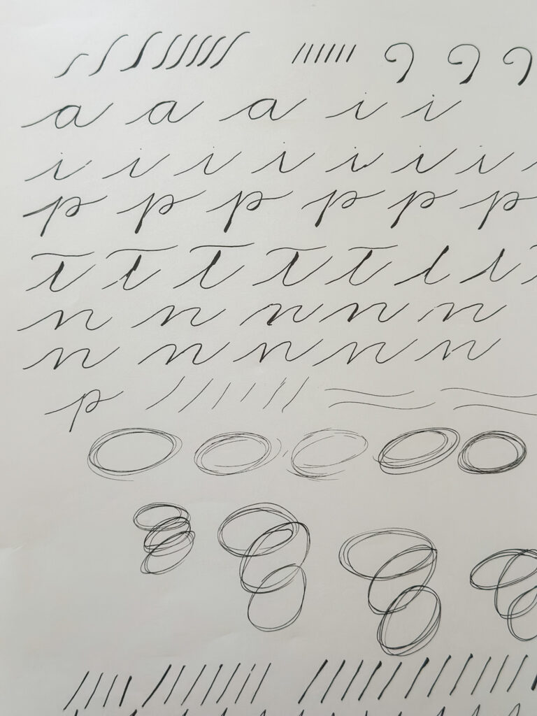
It’s back to the practice worksheets as I come to grips with this type of script.
For more information on Paul’s work or joining his community (which I highly suggest). The community is wonderful, and I am an existing member, so come Find Me Lettering.