

I’m going to show you how to choose fonts that will attract your ideal client or customer. How changing the fonts and colours within your website (and brand) can drastically change your overall look and style. Which, in turn, can help attract that ideal client or customer!
Let’s begin by choosing your colour palette:
1. FIND YOUR COLOR PALETTE HERE
2. FIND YOUR FONTS HERE
The Next Step:
-
IT’S TIME TO NARROW DOWN THE LIST OF FONTS YOU TOOK FROM ABOVE.
-
Make sure that the fonts you choose go well together. Also known as: NOT USING A HIGH CONTRAST (BOLD SERIF) AND PAIRING IT WITH A CHUNKY SLAB SERIF, BUT USING A SANS-SERIF THAT WON’T STEAL THE SHOW FROM THE PRIMARY
-
Choose one of the following with the 3–4 fonts you’ve narrowed down:
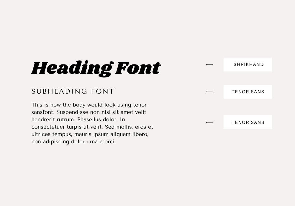
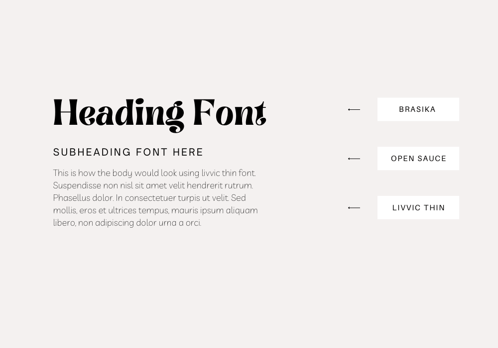
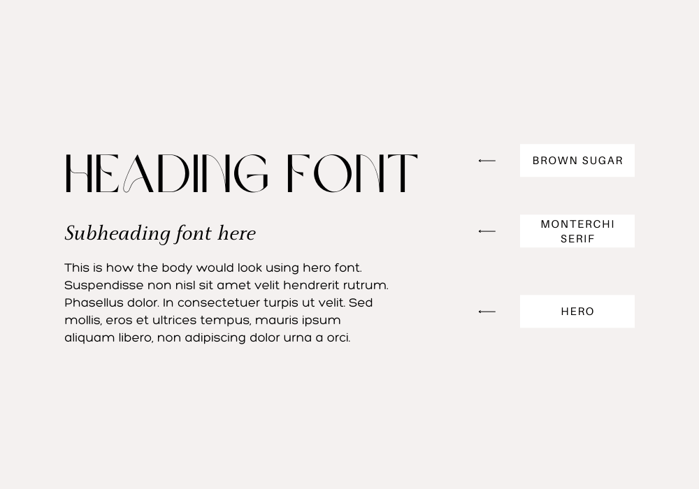
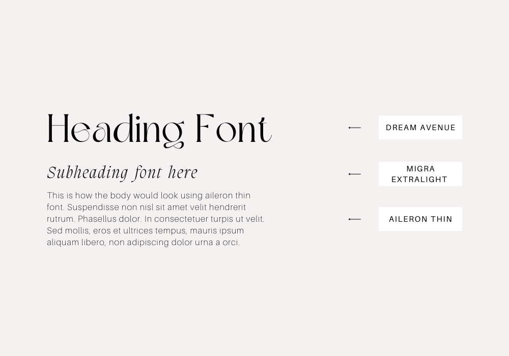
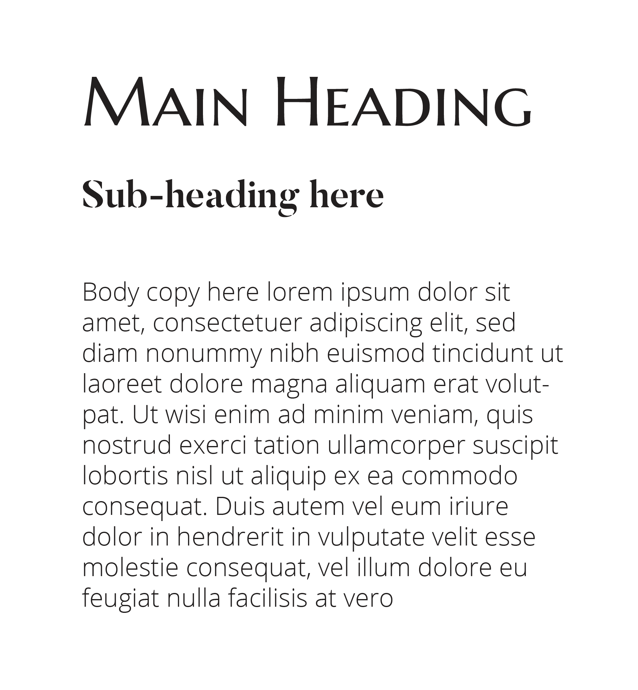
PRIMARY FONT
This is your main ‘brand’ font. Typically it’s seen in your logo and what you will most likely use for your heading 1. This can be used as all UPPERCASE, maybe it’s Italicized, maybe it has more S P A C I N G, or maybe it’s just Normal.
SECONDARY FONT
This is the font that will complement the Primary font (and what I normally use for Heading 2 or 3). I tend to do a font that won’t compete with the primary too much. AKA: If using a Serif Uppercase for Primary you can pair it with an italic lowercase version (as it’s different enough) or an uppercase sans-serif to compliment.
ACCENT FONT
This font is what I like to set all the calligraphy and lettering fonts as..the accent. It’s not always recommended that you use these fonts for a lot of headings because they can be difficult to read at times. So, if your logo is in calligraphy, you can use a calligraphy font as an accent to pull it together. You’ll notice in my brand, the handwriting script is my accent, and you only see it used sparingly. You’ll notice, even as an accent, it still connects to my brand and pulls it together when sprinkled here and there..without it feeling too busy.
PARAGRAPH
This is a crucial one actually..because just changing your overall paragraph text from serif to a sans-serif can give a completely different vibe (From classic to modern). I recommend using a style of your primary or second font. If your Primary is serif, your secondary is uppercase sans-serif, your paragraph can be either the serif or sans serif.