

Colour theory is one of the most important ideas in art, design, and many other visual fields. There isn’t a set of “golden rules” that everyone agrees on when it comes to colour theory, but there are some basic rules and principles that can help you understand and use colour well. Here are five basic ideas that are often linked to colour theory:
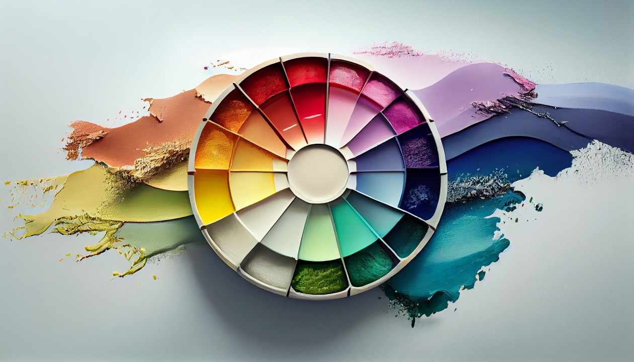
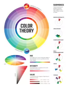
Colour Wheel: In colour theory, the colour wheel is one of the most essential tools. Red, blue, and yellow are the primary colours. Green, orange, and purple are the secondary colors. And between primary and secondary colours are middle or tertiary colours. To make colour schemes that look good, you need to know how the colours on the wheel relate and how they work together.
For colour harmony to be achieved, you need to choose colours that go well together and make a nice visual balance. Complementary colour harmonies are colours that are next to each other on the colour wheel, analogous are colours that are next to each other on the colour wheel, and triadic are colours that are evenly spread on the colour wheel. You can use these harmonies to help your drawings have balance and contrast.
Colour Temperature: Warm colours are reds, yellows, and oranges, and cool colours are blues, greens, and purples. To show feelings and set the mood in your works, you need to know about color temperature. Cool colours can make you feel calm and peaceful, while warm colours can make you feel energized and cozy.
Colour Value: A colour’s value tells you how light or dark it is. To give the variety and depth of your designs, you need a colour palette with a range of values. When picking colours for a project, it’s important to think about the audience and the situation because colours can have psychological and cultural meanings. High contrast between light and dark values can make things stand out, while low contrast can make things look more natural and balanced. For instance, the colour red can mean emotion or danger, while the colour blue is often linked to trust and dependability. Knowing how colours make people feel and what they mean in different cultures can help you communicate your point in your work.
These five rules are a good starting point for learning about colour theory and using it in different artistic fields. Remember that colour theory is a big area that is always changing. As you learn more about color, there are many more advanced ideas and techniques to discover.
Text on coloured backgrounds
Black text is recommended for use on light backgrounds and white text on dark backgrounds. If your app has both light and dark themes, make…
Black text is recommended for use on light backgrounds and white text on dark backgrounds. If your logo has light and dark themes, make sure the text is available in contrasting colours against each theme.
Coloured backgrounds or typography also change the rules regarding text opacity and different text states.
Coloured text and backgrounds
Coloured text should be used sparingly to draw attention and apply selective emphasis. It should be reserved for text elements such as headlines.
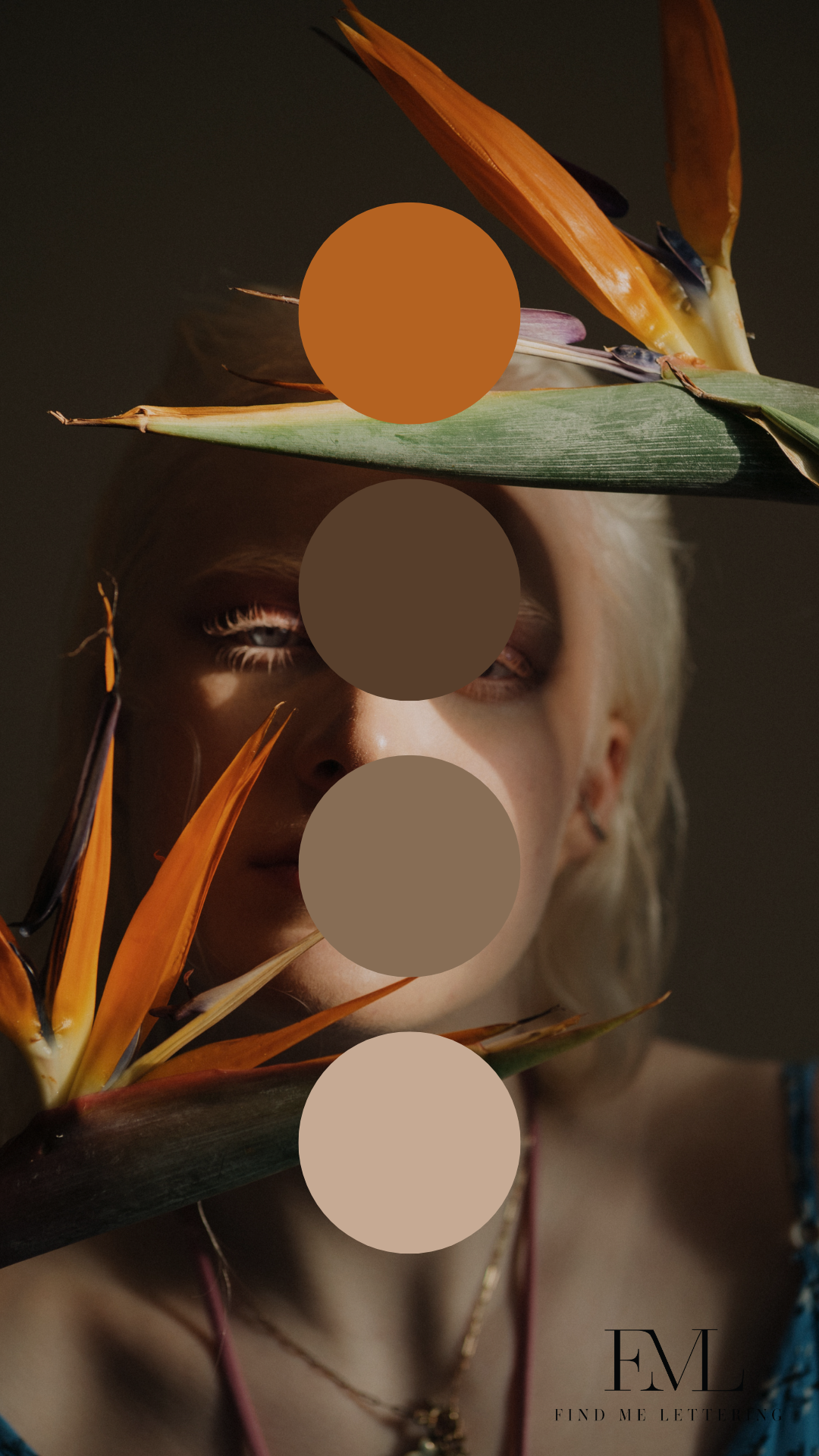
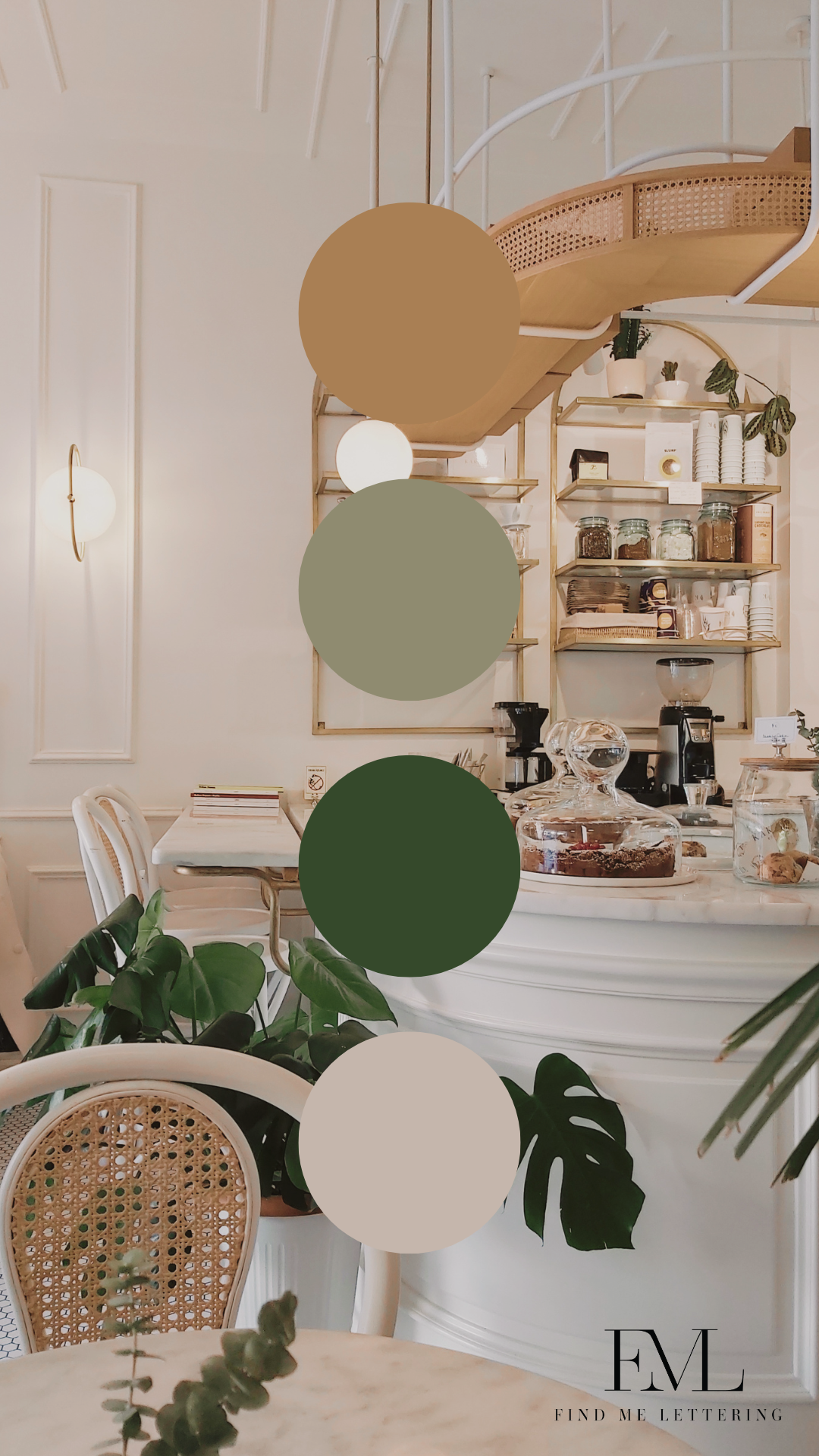
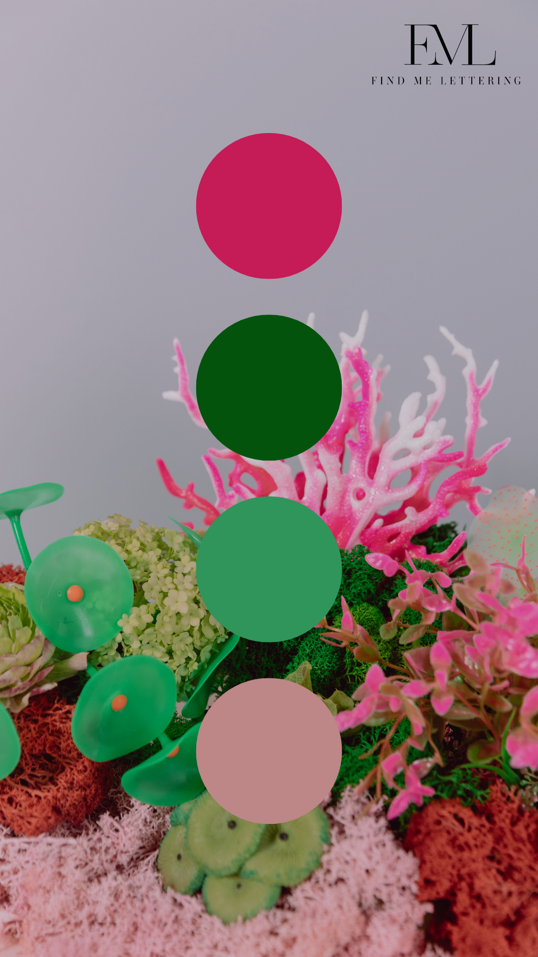
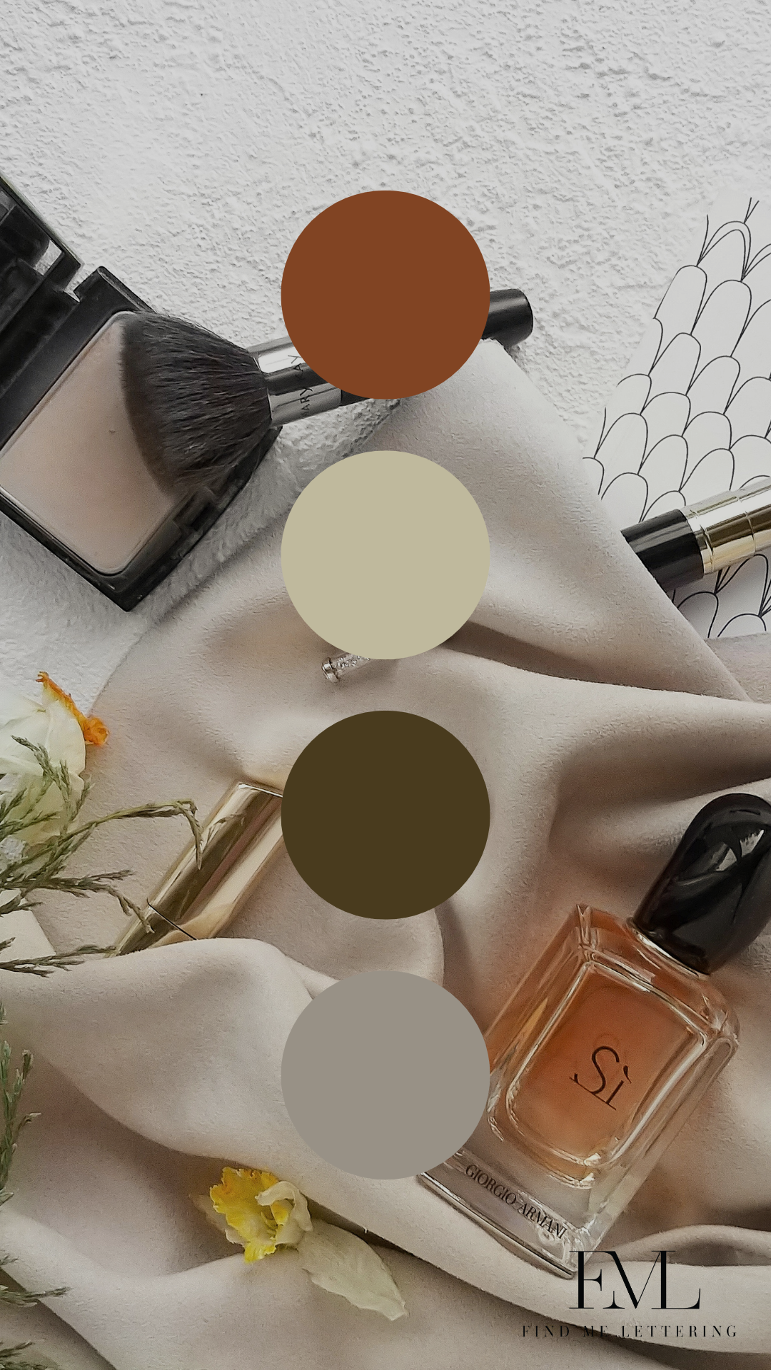
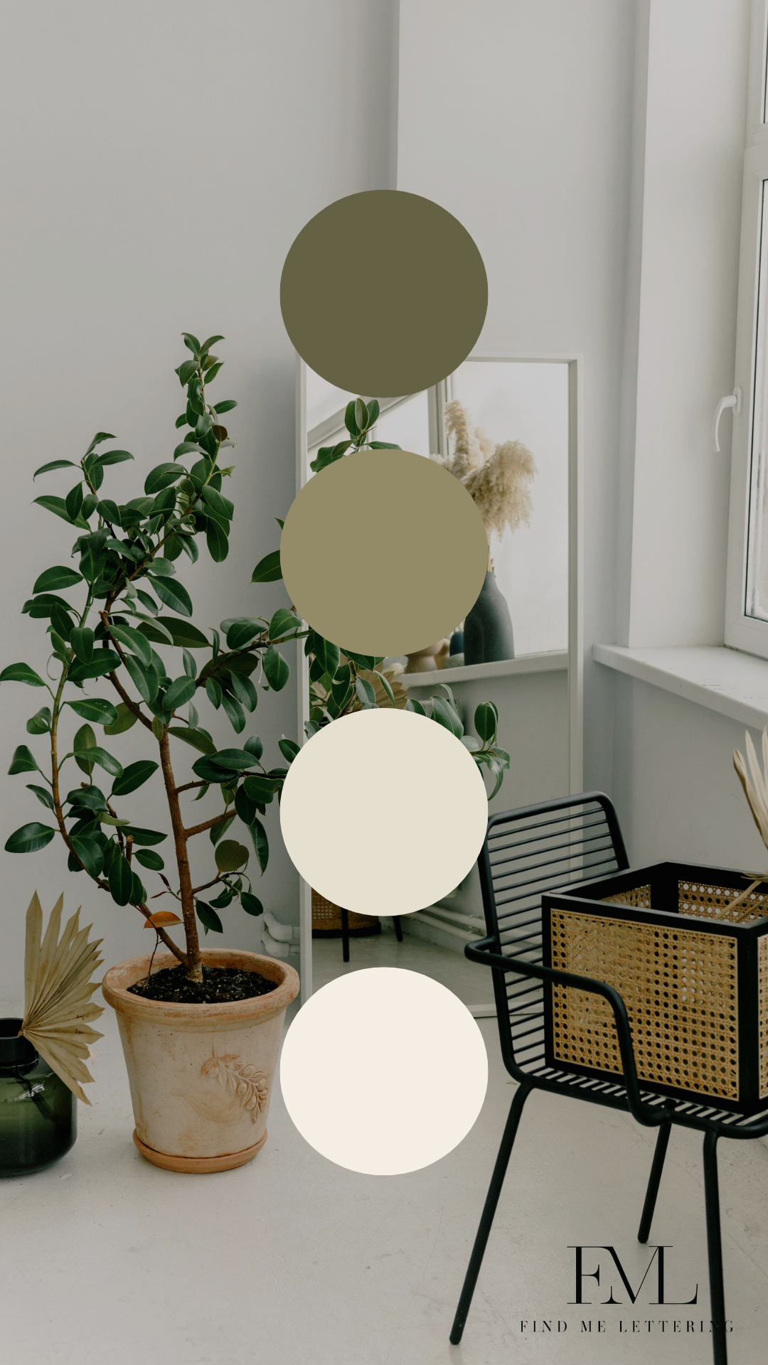
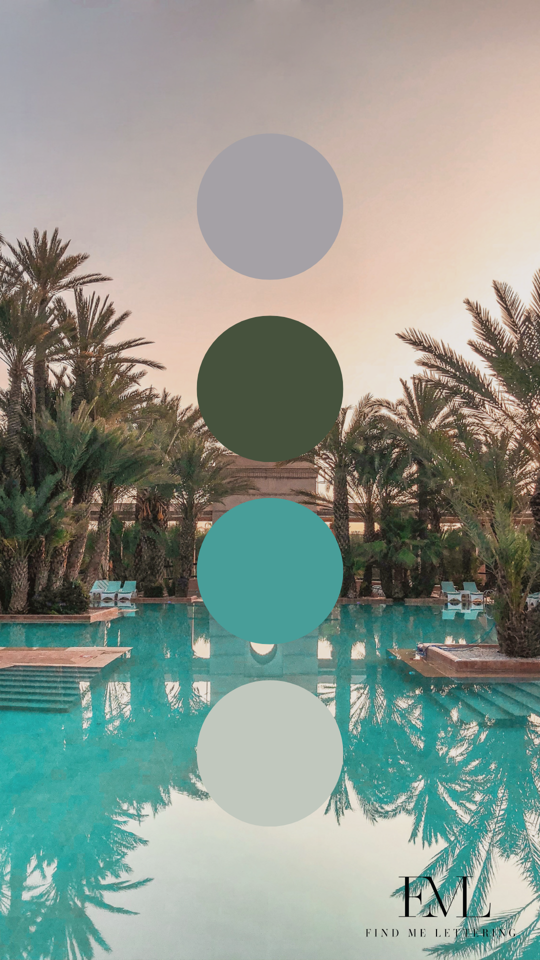
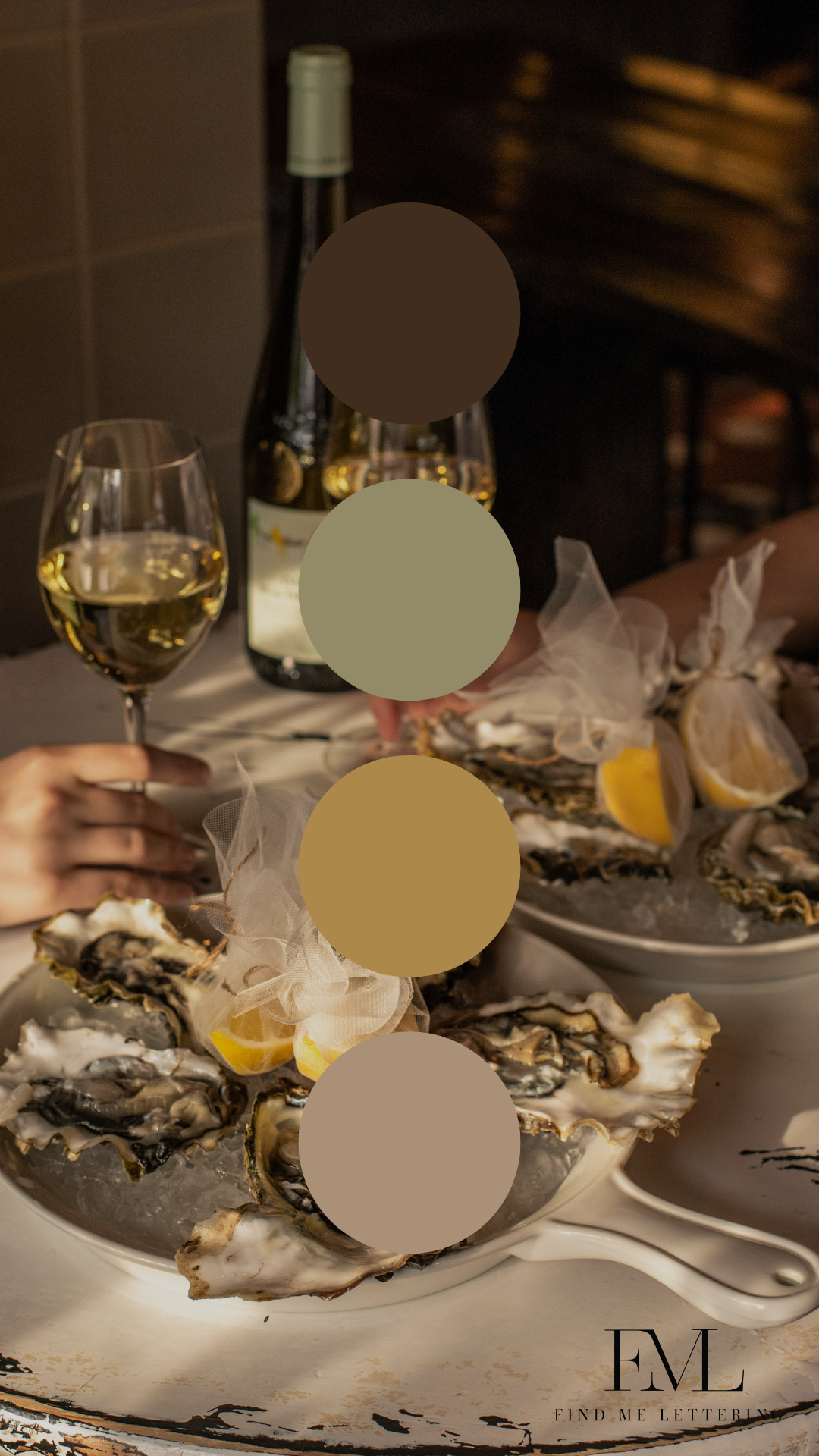
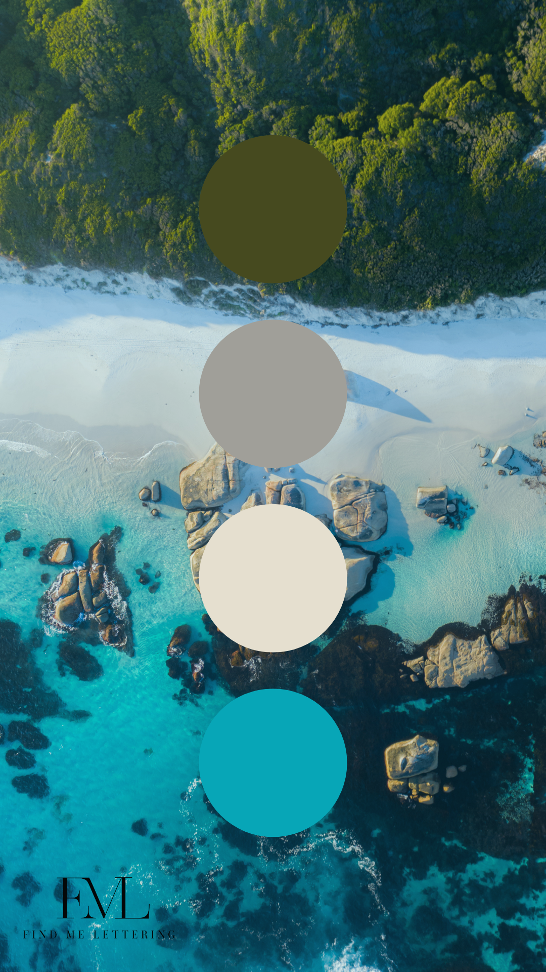
Below are various colour palettes I have developed for industries looking to up-level their presence with colour.
View fullsize
View fullsize
View fullsize
View fullsize
View fullsize

View fullsize

View fullsize

View fullsize

View fullsize

View fullsize

View fullsize
View fullsize

View fullsize
View fullsize
View fullsize